View clipping in SwiftUI
 @zntfdr
📚 This article comes with a companion app! Download it here.
Masking is a powerful technique that we can use to push our app's design to the next level.
SwiftUI offers various ways to do just that: let's take a tour where it all begins by exploring clipping in SwiftUI.
Clipping Masks
Every view comes with a bound frame. This frame is used for composing the overall view hierarchy layout. When it comes to the drawing phase, the view content can exceed its bound frame (also known as bleeding).
For example, consider the following view:
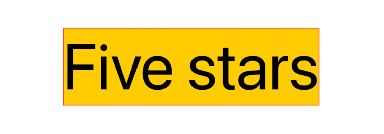
Text("Five stars")
  .background(Color.yellow)
  .font(.system(size: 90))
  .border(Color.red)
The red border shows the content frame, which, in this case, also coincides with the bound frame.
Let's take a look at another example:
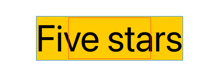
Text("Five stars")
  .background(Color.yellow)
  .font(.system(size: 90))
  .fixedSize()
  .border(Color.blue)
  .frame(width: 200, height: 100)
  .border(Color.red)
Here Text takes as much space as it needs, thanks to the fixedSize() view modifier. However, we also apply another .frame(width: 200, height: 50) view modifier on top of that.
For the rest of the view hierarchy, this view bound is represented by the red border, while the blue border represents the space the view content takes.
On the layout phase:
- only the bound frame/red border will be considered
- the content frame/blue border is completely disregarded
As SwiftUI allows content bleeding by default, the content is drawn even when it extends beyond the view frame edges. To avoid this, we can use clipping:
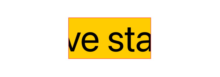
Text("Five stars")
  .background(Color.yellow)
  .font(.system(size: 90))
  .fixedSize()
  .border(Color.blue)
  .frame(width: 200, height: 100)
  .border(Color.red)
  .clipped() // 👈🏻
The clipped() view modifier limits the drawing of a view to its bound frame, everything else will be hidden.
In other words, clipped() applies a mask equivalent to the bound frame "rectangle", thus hiding anything that goes beyond that rectangle.
SwiftUI comes with two clipped() alternatives: cornerRadius(_:) and clipShape(_:style).
Corner Radius
cornerRadius(_:) behaves exactly like clipped(), but instead of matching 1:1 the bound frame, it also lets us specify a corner radius to be applied in the final mask:
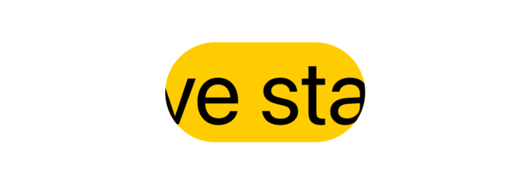
Text("Five stars")
  .background(Color.yellow)
  .font(.system(size: 90))
  .fixedSize()
  .frame(width: 200, height: 100)
  .cornerRadius(50) // 👈🏻
Using the same thought process from before, cornerRadius(_:) applies a mask equivalent to the view bound frame rectangle, this time with rounded corners.
.clipped() can be seen as a more performant convenience over .cornerRadius(0).
Clip Shape
So far we've been playing with just rectangles, clipShape(_:style:) removes this limitation and lets us use any shape as the clipping mask:
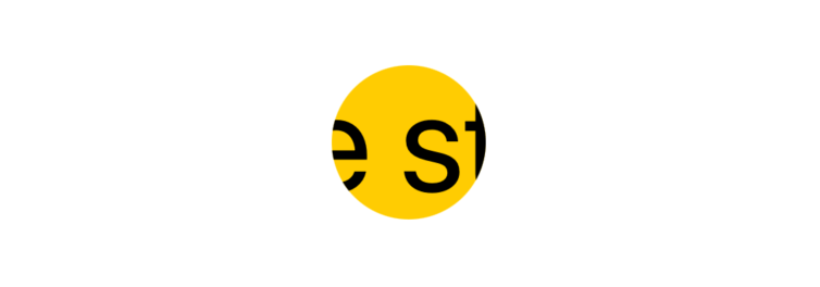
Text("Five stars")
  ...
  .clipShape(Circle())
Shapes fit as best as they can within the natural size of the view that contains them, a.k.a. the view bound frame.
We're not limited to the shapes SwiftUI offers. We can also declare our own:
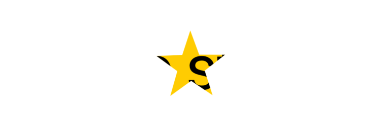
Text("Five stars")
  ...
  .clipShape(Star())
Similarly to how .clipped() can be seen as a convenience over .cornerRadius(0), .cornerRadius(x) can be seen as a convenience over .clipShape(RoundedRectangle(cornerRadius: x)).
Even-odd rule
When defining a Shape, it's acceptable for some of its parts to be drawn over multiple times. We can consider those sections to be "overlapping areas". For example, take this DoubleEllipse Shape definition, which consists of two ellipses overlapping by an arbitrary amount:
struct FSView: View {
  @State var overlapping: Double = 0.1

  var body: some View {
    VStack {
      DoubleEllipse(overlapping: overlapping)
        .frame(width: 300, height: 100)
      HStack {
        Text("Overlapping")
        Slider(value: $overlapping, in: 0.0...1.0)
      }
    }
  }
}

struct DoubleEllipse: Shape {
  /// 1 = complete overlap
  /// 0 = no overlap
  @Clamping(0.0...1.0) var overlapping: Double = 0

  func path(in rect: CGRect) -> Path {
    let rectSize = CGSize(width: (rect.width / 2) * (1 + overlapping), height: rect.height)

    var path = Path()
    path.addEllipse(in: CGRect(origin: .zero, size: rectSize))
    let secondEllipseOrigin = CGPoint(x: (rect.width / 2) * (1 - overlapping), y: rect.origin.y)
    path.addEllipse(in: CGRect(origin: secondEllipseOrigin, size: rectSize))

    return path
  }
}
By default, SwiftUI draws everything as defined. However, we can also apply a fill(style:) Shape modifier that threats those overlapping areas differently:
struct FSView: View {
  @State var overlapping: Double = 0.1

  var body: some View {
    VStack {
      DoubleEllipse(overlapping: overlapping)
        .fill(style: FillStyle(eoFill: true, antialiased: true)) // 👈🏻
        .frame(width: 300, height: 100)
      HStack {
        Text("Overlapping")
        Slider(value: $overlapping, in: 0.0...1.0)
      }
    }
  }
}
The magic is all in the oeFill parameter, where eo stands for Even-odd (rule), described as:
«A point "insideness" in a shape is determined by drawing a ray from that point to infinity in any direction and counting the number of path segments from the given shape that the ray crosses. If this number is odd, the point is inside; if even, the point is outside.»
The definition goes beyond just overlapping, but this is most likely how it will be used when masking in SwiftUI.
The fill(style:) Shape modifier returns some View, meaning that we cannot use it with clipShape(_:style:), as the latter requires a Shape instance. With that being said, .clipShape(_:style:) second parameter addresses this, letting us pass a FillStyle:
VStack {
  Text("Five stars")
    .background(Color.yellow)
    .font(.system(size: 90))
    .clipShape(
      OverlappingEllipses(ellipsesNumber: ellipsesNumber, overlapping: overlapping),
      style: FillStyle(eoFill: true, antialiased: false) // 👈🏻
    )
  Stepper("Ellipses number:", value: $ellipsesNumber, in: 2...16)
  HStack {
    Text("Overlapping")
    Slider(value: $overlapping, in: 0.0...1.0)
  }
}
Animating clipping masks
Shapes conform to both View and Animatable, we can declare a var animatableData: CGFloat in our shapes in order to take advantage of this:
struct OverlappingEllipses: Shape {
  @Clamping(1...Int.max) var ellipsesNumber: Int = 2
  @Clamping(0.0...1.0) var overlapping: Double = 0

  var animatableData: CGFloat { // 👈🏻
    get { overlapping }
    set { overlapping = newValue }
  }

  func path(in rect: CGRect) -> Path {
    ...
  }
}
With this, we can put everything we've covered so far and easily obtain some trippy effects:
struct FSView: View {
  @State var overlapping: Double = 0

  var body: some View {
    VStack(spacing: 16) {
        Text("Five stars")
          ...
          .clipShape(
            OverlappingEllipses(ellipsesNumber: 8, overlapping: overlapping),
            style: FillStyle(eoFill: true, antialiased: false)
          )

      Text("Five stars")
        ...
        .clipShape(
          OverlappingRectangles(rectanglesNumber: 8, overlapping: overlapping),
          style: FillStyle(eoFill: true, antialiased: false)
        )

      Button("Show/Hide") {
        withAnimation(.easeInOut(duration: 2)) {
          overlapping = overlapping == 1 ? 0 : 1
        }
      }
    }
  }
}
The complete source code can be found here.
Conclusions
View masking starts simple and gets powerful quickly: in this article, we've seen an overview of view clipping, but this is just the simplest masking method SwiftUI offers. Stay tuned for the second part!
Do you use masking in your apps? What effects have you built? Please let me know!