How to create custom SwiftUI view styles
 @zntfdr
When building new SwiftUI components, it's common to offer variants for different purposes/screens.
One way to manage such variants is via styles, for example by using instances conforming to LabelStyle or ButtonStyle:
HStack {
  Label("The title will be hidden", systemImage: "moon.circle.fill")
    .labelStyle(IconOnlyLabelStyle())

  Button("Tap me") {
    // handle button tap
  }
  .buttonStyle(BorderlessButtonStyle())
}

We took deep dives on both components styling here (for
Label) and here (forButton).
These styles are set in SwiftUI's environment. Instead of declaring them for each component, we could set them on a parent view, making its children inherit the styles automatically:
VStack {
  // All `Label`s declared here will have the title hidden.

  Label("Sun", systemImage: "sun.min.fill")
  Label("Moon", systemImage: "moon.fill")

  ...
}
.labelStyle(IconOnlyLabelStyle())

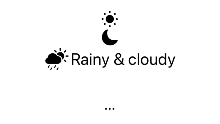
Moreover, as each view will have its environment passed down from the parent, we can always override a style when needed:
VStack {
  Label("Sun", systemImage: "sun.min.fill")
  Label("Moon", systemImage: "moon.fill")

  // This `Label` will display both title and icon.
  Label("Rainy & cloudy", systemImage: "cloud.sun.rain.fill")
    .labelStyle(TitleAndIconLabelStyle())

  ...
}
.labelStyle(IconOnlyLabelStyle())
Wouldn't it be cool if we could have the same elasticity in our own SwiftUI views? In this article, let's learn how to do just that!
Here's a sneak peek of the view and styles we will build:
The view
We're going to build a generic Card component:
struct Card<Content: View>: View {
  var content: () -> Content

  var body: some View {
    content()
  }
}
We've covered this technique in Composing SwiftUI views.
Card takes in a method returning a View, this view is our Card's body (for the moment). Here are a couple of examples:
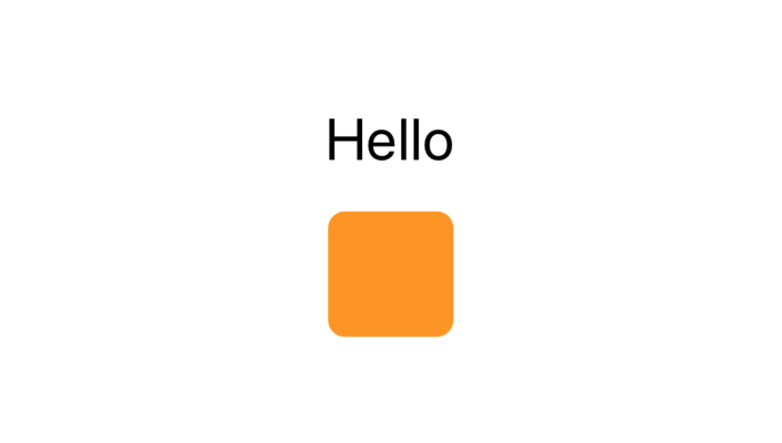
Card {
  Text("Hello")
}

Card {
  RoundedRectangle(cornerRadius: 8)
    .fill(Color.orange)
    .frame(width: 44, height: 44)
}
No magic yet, let's move on to the next step.
The view style protocol
With our view declared it's time to define its style, we will call it CardStyle, consistent with SwiftUI's styles naming. CardStyle is going to be the protocol all our styles will conform to.
CardStyle contains only one requirement: a makeBody(configuration:) function returning the original Card with our style applied.
As we're defining a protocol, we will use an associatedtype to require the function to return a View (we can't directly use generics in protocol definitions):
protocol CardStyle {
  associatedtype Body: View
  typealias Configuration = CardStyleConfiguration

  func makeBody(configuration: Self.Configuration) -> Self.Body
}
Every customizable SwiftUI style follows the same signature as above, here are all of them:
ButtonStyle,GroupBoxStyle,LabelStyle,MenuStyle,PrimitiveButtonStyle,ProgressViewStyle,ToggleStyle.
makeBody(configuration:) needs a way to access to the original Card body:
this is why the method accepts a CardStyleConfiguration parameter, let's define that next.
The
typealiasis there mainly to have a consistent signature between allmakeBody(configuration:)across all styles of all views. We could remove it, but our style implementations would become more verbose and inconsistent with the rest of SwiftUI styles.
The view style configuration
The style configuration has two main goals:
- give us access to the original view
body - give us access to any relevant property of the view
In CardStyleConfiguration we don't need any relevant property (as it's a very generic view), however here are some examples from other SwiftUI views:
ToggleStyleConfigurationexposes the (Toggle's)isOnstateButtonStyleConfigurationexposes the (Button's)isPressedstateProgressViewStyleConfigurationexposes the (ProgressView's)fractionCompletedvalue
In most configurations the original body is exposed via a label property, we will follow the same pattern here.
It's not possible for label (a.k.a. our original Card body) to know in advance what its type is going to be, for this reason label will be exposed as a type-erased View (we cannot store a generic, non-computed some View value):
struct CardStyleConfiguration {
  /// A type-erased label of a Card.
  struct Label: View {
    init<Content: View>(content: Content) {
      body = AnyView(content)
    }

    var body: AnyView
  }

  let label: CardStyleConfiguration.Label
}
Once again, this signature follows other SwiftUI configurations.
View styles
Our view is not ready to accept styles yet, however for clarity's sake there will be some images showing the final outcome when the style is applied.
We now have everything we need to start defining our own styles! Let's waste no time:
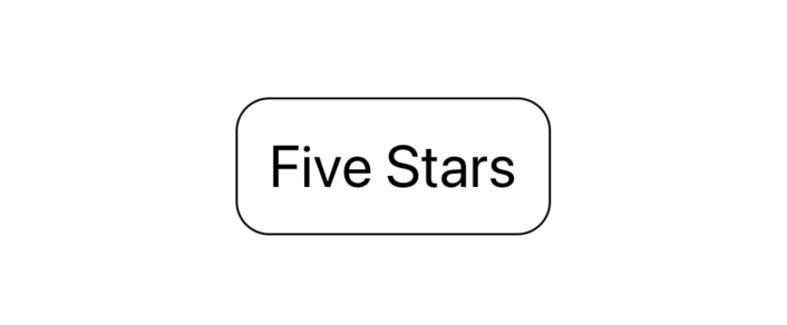
struct RoundedRectangleCardStyle: CardStyle {
  func makeBody(configuration: Configuration) -> some View {
    configuration.label
      .font(.title)
      .padding()
      .background(RoundedRectangle(cornerRadius: 16).strokeBorder())
  }
}
struct CapsuleCardStyle: CardStyle {
  var color: Color

  func makeBody(configuration: Configuration) -> some View {
    configuration.label
      .font(.title)
      .foregroundColor(.white)
      .padding()
      .background(
        Capsule().fill(color)
      )
      .background(
        Capsule().fill(color.opacity(0.4)).rotationEffect(.init(degrees: -8))
      )
      .background(
        Capsule().fill(color.opacity(0.4)).rotationEffect(.init(degrees: 4))
      )
      .background(
        Capsule().fill(color.opacity(0.4)).rotationEffect(.init(degrees: 8))
      )
      .background(
        Capsule().fill(color.opacity(0.4)).rotationEffect(.init(degrees: -4))
      )
  }
}

struct ShadowCardStyle: CardStyle {
  func makeBody(configuration: Configuration) -> some View {
    configuration.label
      .font(.title)
      .foregroundColor(.black)
      .padding()
      .background(Color.white.cornerRadius(16))
      .shadow(color: Color.black.opacity(0.2), radius: 8, x: 0, y: 4)
  }
}

struct ColorfulCardStyle: CardStyle {
  var color: Color

  func makeBody(configuration: Configuration) -> some View {
    configuration.label
      .font(.title)
      .foregroundColor(.white)
      .shadow(color: Color.white.opacity(0.8), radius: 4, x: 0, y: 2)
      .padding()
      .background(color.cornerRadius(16))
      .shadow(color: color, radius: 8, x: 0, y: 4)
  }
}

These are just a few examples but sky's the limit: we can always add more CardStyle implementations (or let other developers using Card do so).
The default view style
We should provide a default style that all Cards will reach for when no other style has been applied.
We could pick one of the current styles, however we probably would like to have different default styles based on the current context, here's an example where we pick a different style based on whether we're on a mac or on an iOS device:
struct DefaultCardStyle: CardStyle {
  func makeBody(configuration: Configuration) -> some View {
    #if os(iOS)
      return ShadowCardStyle().makeBody(configuration: configuration)
    #else
      return RoundedRectangleCardStyle().makeBody(configuration: configuration)
    #endif
  }
}
This definition is just a proxy to other styles we have defined earlier, however it shows how we can dynamically change styles if/when necessary.
The environment style value
CardStyle is not directly handed to Card via a parameter: instead, the style is passed down to the view via SwiftUI's environment.
There are two steps that we must take in order to add CardStyle in the environment:
- Create a card style
EnvironmentKey - Add a card style among the
EnvironmentValues
EnvironmentValues is the collection of environment values that a given view sees, as these values are propagated through the view hierarchy, different views will potentially see different values.
Internally each value is accessed via an EnvironmentKey, which also declares the default value (and type) associated to the key.
Let's start by defining our EnvironmentKey, these are the protocol requirements:
public protocol EnvironmentKey {
  associatedtype Value
  static var defaultValue: Self.Value { get }
}
Ideally we would like to declare the following CardStyle key:
struct CardStyleKey: EnvironmentKey {
  static var defaultValue: CardStyle = DefaultCardStyle()
}
However, similarly to CardStyleConfiguration, we cannot declare a stored property with a protocol type, instead, CardStyleKey needs a concrete type (and value) for its defaultValue property.
CardStyleKey not only will be used to propagate any card style in the view hierarchy, but it also needs to accept any card style as well. The solution lies once more with type erasure, which we apply by defining a new AnyCardStyle:
struct AnyCardStyle: CardStyle {
  private var _makeBody: (Configuration) -> AnyView

  init<S: CardStyle>(style: S) {
    _makeBody = { configuration in
      AnyView(style.makeBody(configuration: configuration))
    }
  }

  func makeBody(configuration: Configuration) -> some View {
    _makeBody(configuration)
  }
}
AnyCardStyle is a special style that piggy-backs on another CardStyle implementation:
to create an AnyCardStyle instance we need to pass another CardStyle instance, which then will be used internally by AnyCardStyle to define its own makeBody(configuration:).
In other words, AnyCardStyle is a type-erased CardStyle, which is exactly what we wanted to achieve. Thanks to this new definition we have a concrete CardStyle that we can pass in the environment:
struct CardStyleKey: EnvironmentKey {
  static var defaultValue = AnyCardStyle(style: DefaultCardStyle())
}
We can now add CardStyle among the EnvironmentValues:
extension EnvironmentValues {
  var cardStyle: AnyCardStyle {
    get { self[CardStyleKey.self] }
    set { self[CardStyleKey.self] = newValue }
  }
}
With this extension our environment setup is complete!
The convenience view modifier
Thanks to our new definitions we can set cardStyle anywhere by using the environment(_:_:) view modifier:
MyView()
  .environment(\.cardStyle, AnyCardStyle(style: BorderCardStyle(color: .blue)))
And we can read it in any view via the @Environment property wrapper:
MyView: View {
  @Environment(\.cardStyle) var cardStyle

  ...
}
While the reading side is great, the writing side requires developers to know about our AnyCardStyle type erasure, which really is an implementation detail.
This is one of the reasons why SwiftUI defines some xxxStyle(_:) convenience view modifiers (e.g. myView.buttonStyle(BorderlessButtonStyle())), let's do the same for our style:
extension View {
  func cardStyle<S: CardStyle>(_ style: S) -> some View {
    environment(\.cardStyle, AnyCardStyle(style: style))
  }
}
Thanks to this new view modifier, which can applied to any view, we can set the cardStyle environment via:
MyView()
  .cardStyle(ColorfulCardStyle(color: .red))
Which is more concise, clear, and doesn't require knowing any details of the original implementation.
Updating our view
The full infrastructure is complete, the last thing left is to make sure the correct style is applied to our view, here's how we can update our Card definition:
struct Card<Content: View>: View {
  @Environment(\.cardStyle) var style
  var content: () -> Content

  var body: some View {
    style
      .makeBody(
        configuration: CardStyleConfiguration(
          label: CardStyleConfiguration.Label(content: content())
        )
      )
  }
}
Beside fetching the card style from the environment, the view body has completely changed:
instead of content(), body now returns the environment style's makeBody(configuration:) output, where we pass the original body content() as a parameter of the style configuration.
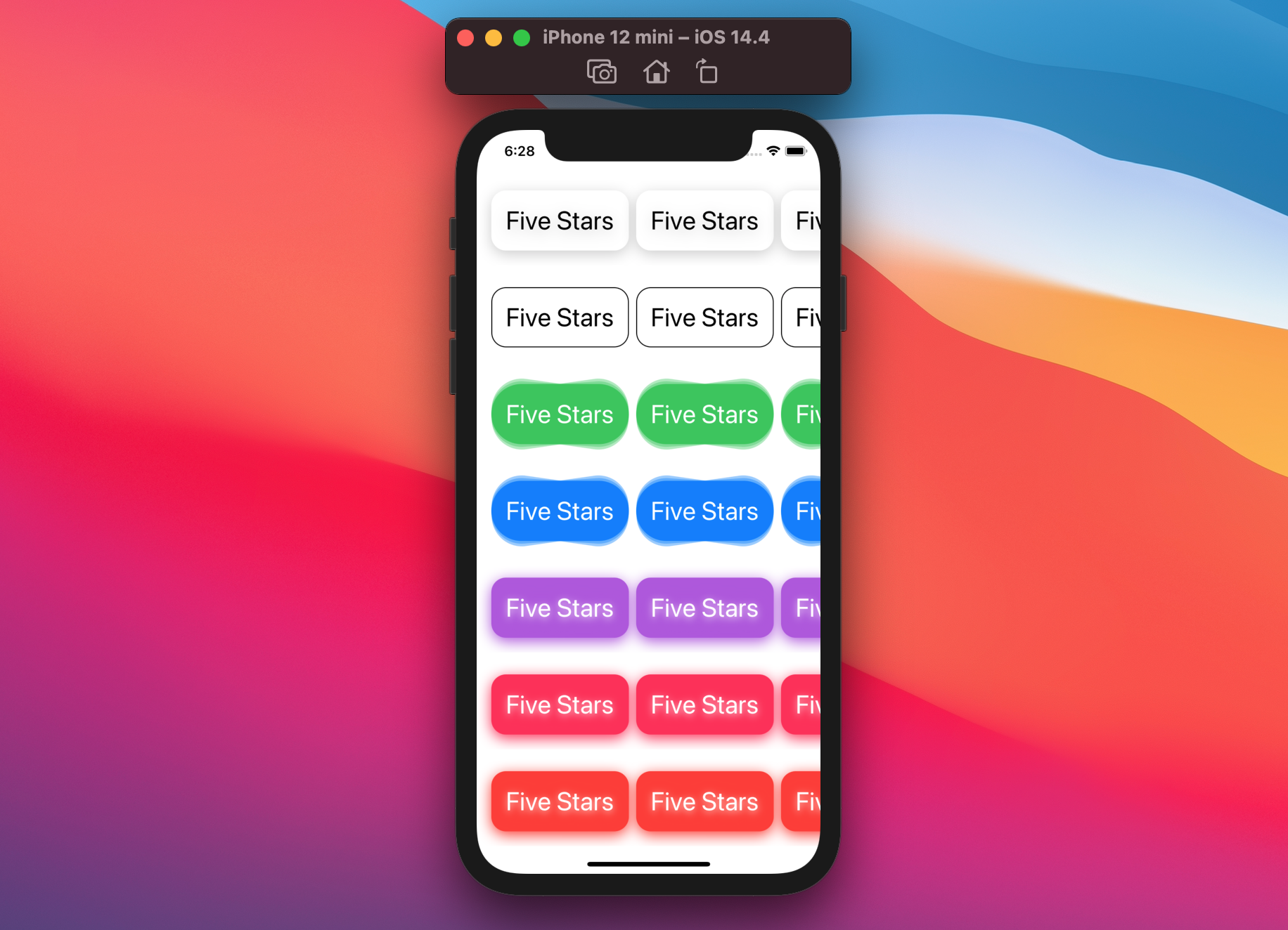
With this last step we're now ready to use all our styles in any Card we'd like in any way we please, here's the code for the sneak peek at the beginning of the article:
struct ContentView: View {

  var body: some View {
    ScrollView {
      LazyVStack {
        // Default style
        Section {
          sectionContent
        }

        // RoundedRectangleCardStyle
        Section {
          sectionContent
        }
        .cardStyle(RoundedRectangleCardStyle())

        // CapsuleCardStyle - green
        Section {
          sectionContent
        }
        .cardStyle(CapsuleCardStyle(color: .green))

        // CapsuleCardStyle - blue
        Section {
          sectionContent
        }
        .cardStyle(CapsuleCardStyle(color: .blue))

        // ColorfulCardStyle - purple
        Section {
          sectionContent
        }
        .cardStyle(ColorfulCardStyle(color: .purple))

        // ColorfulCardStyle - pink
        Section {
          sectionContent
        }
        .cardStyle(ColorfulCardStyle(color: .pink))

        // ColorfulCardStyle - red
        Section {
          sectionContent
        }
        .cardStyle(ColorfulCardStyle(color: .red))
      }
    }
  }

  var sectionContent: some View {
    ScrollView(.horizontal) {
      LazyHStack {
        ForEach(1..<5) { _ in
          Card {
            Text(verbatim: "Five Stars")
          }
        }
      }
      .padding()
    }
  }
}
Steps recap
It took us a while to complete the whole picture, but both the final API and data flow matches SwiftUI's without compromises.
In short, these are the steps we took:
- Create view
- Create view style protocol
- Create style configuration
- Implement base view styles
- Define view default style
- Setup style environment (key + environment value + style eraser)
- Define
.xxxStyle(_:)convenience view modifier - Update view to take advantage of environment style
The final gist, with the steps above highlighted along the way, can be found here.
Conclusions
Regardless of whether we're planning to build our own styles or not, it's hard to not appreciate how much work is hidden behind just an @Environment property wrapper and a .xxxStyle(_:) view modifier:
at the end of the day this is all developers using SwiftUI's styles (or ours) will see, and really this is all they should need to know.
Have you built or are you planning to build a component with styles this way? Have you see any other interesting approaches? I'd love to hear!
Thank you for reading and stay tuned for more articles.