SwiftUI's Label
 @zntfdr
Label is a new SwiftUI component. The SwiftUI team did a great job with Label's documentation: if you're not familiar with this view yet, please have a read at it first.
Label combines a text and an image into a single view. It also adapts based on the context (e.g., if it's put on a toolbar) and dynamic type.
In this article, let's explore this view beyond the basics.
Initializers
Label comes with six initializers:
- the first four offer all possible combinations of text as
StringProtocolorLocalizedStringKey, and an image from an assets catalog or SF Symbols
extension Label where Title == Text, Icon == Image {
  public init(_ titleKey: LocalizedStringKey, image name: String)
  public init(_ titleKey: LocalizedStringKey, systemImage name: String)
  public init<S: StringProtocol>(_ title: S, image name: String)
  public init<S: StringProtocol>(_ title: S, systemImage name: String)
}
- the most flexible initializer takes two generics views, no strings attached
extension Label {
  public init(@ViewBuilder title: () -> Title, @ViewBuilder icon: () -> Icon)
}
- the last initializer takes in a
LabelStyleConfiguration
extension Label where Title == LabelStyleConfiguration.Title, Icon == LabelStyleConfiguration.Icon {
  public init(_ configuration: LabelStyleConfiguration)
}
Every initializer has its place and use: we will cover all of them in this article.
Label styles
Unless we're in a particular context (e.g., a navigation bar), both Label's title and image are displayed by default.
If we want to show only one of the two components (either the image or just the title), or change our Label appearance in other ways, we can do so via the labelStyle(_:) view modifier:
this modifier accepts a LabelStyle instance.
LabelStyle tells SwiftUI how we would like the Label to be drawn on screen, by default we have three options:
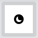
.iconOnly.titleOnly.automatic
The names are self-explanatory. These backed-in styles are mutually exclusive: if we apply multiple styles to the same Label, only the closest one to the Label will take effect.
// Only `.iconOnly` will be applied to the label:
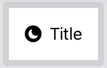
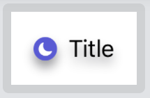
Label("Title", systemImage: "moon.circle.fill")
.labelStyle(.iconOnly)
.labelStyle(.titleOnly)
.labelStyle(DefaultLabelStyle())
As LabelStyle is a protocol, we can define our own styles:
public protocol LabelStyle {
  associatedtype Body: View

  func makeBody(configuration: Self.Configuration) -> Self.Body

  typealias Configuration = LabelStyleConfiguration
}
Similarly to ViewModifier, LabelStyle requires a makeBody(configuration:) method, allowing us to define our style.
makeBody(configuration:) takes in a LabelStyleConfiguration instance, which is the same parameter accepted by the last Label initializer we've listed above.
This configuration carries the complete set of instructions that defines the Label up to this point.
We can't define a brand new configuration ourselves, this is reserved to SwiftUI. However, we do have access to the current components of the Label, the image (named icon) and the title:
public struct LabelStyleConfiguration {
  /// A type-erased title view of a label.
  public var title: LabelStyleConfiguration.Title { get }

  /// A type-erased icon view of a label.
  public var icon: LabelStyleConfiguration.Icon { get }
}
Thanks to this configuration, our LabelStyle is applied on top of the current style.
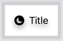
For example, here we build a LabelStyle that adds a shadow to the entire Label:
struct ShadowLabelStyle: LabelStyle {
  func makeBody(configuration: Configuration) -> some View {
    Label(configuration)
      .shadow(color: Color.gray.opacity(0.9), radius: 4, x: 0, y: 5)
  }
}

extension LabelStyle where Self == ShadowLabelStyle {
  public static var shadow: ShadowLabelStyle {
    ShadowLabelStyle()
  }
}
makeBody(configuration:)is the only place where we can use thisLabelinitializer.
As ShadowLabelStyle is styling on top of the current LabelStyle, it will be applied to whatever the Label currently is.
Therefore, if we use it along with .iconOnly for example, the final result will be a Label with just the icon and our shadow:
Label("Title", systemImage: "moon.circle.fill")
  .labelStyle(.shadow)
  .labelStyle(.iconOnly)

Label style erasers
The .labelStyles declaration order is important: previously, we've seen how the three backed-in styles are mutually exclusive. This really means that in their definition, they don't use the configuration passed in makeBody(configuration:), but will create a new one instead.
In other words, .iconOnly, .titleOnly, and .automatic act as style erasers: any previous style is not carried over.
Going back to our ShadowLabelStyle example:
Label("Title", systemImage: "moon.circle.fill")
  .labelStyle(.shadow)
  .labelStyle(.iconOnly)
will output the Label icon with a shadow.
Label("Title", systemImage: "moon.circle.fill")
  .labelStyle(.iconOnly) // <- the label style order has been swapped
  .labelStyle(.shadow)
will output the Label icon with no shadow.
Since we're using a style eraser, SwiftUI won't even bother to apply our style first, this can be verified by adding a breaking point in ShadowLabelStyle's makeBody(configuration:) implementation: SwiftUI won't call our method at all.
This is in line with what we've seen with SwiftUI's preference keys: SwiftUI always strives to do the least amount of work possible.
Can we define our own style eraser?
As mentioned above, only SwiftUI can create new configurations, however there's a simple trick that will make any custom style also a style eraser: apply one of the native style erasers in our makeBody(configuration:) implementation.
struct ShadowEraseLabelStyle: LabelStyle {
  func makeBody(configuration: Configuration) -> some View {
    Label(configuration)
      .shadow(color: Color.gray.opacity(0.9), radius: 4, x: 0, y: 5)
      .labelStyle(.automatic) // <- ✨
  }
}

extension LabelStyle where Self == ShadowEraseLabelStyle {
  public static var shadowErase: ShadowEraseLabelStyle {
    ShadowEraseLabelStyle()
  }
}
In this example we force our Label to display both the text and the icon, along with our shadow, any other style applied previously is ignored:
Label("Title", systemImage: "moon.circle.fill")
  .labelStyle(.shadowErase)
  .labelStyle(.titleOnly)
  .labelStyle(.iconOnly)
Again, since our style now acts as a style eraser, it won't be applied on top of the current style, but will start with a clean Label instead.
LabelStyleConfiguration's icon and title style
We might have tried to erase the style also by passing the two views of our LabelStyleConfiguration to a new Label:
struct ShadowLabelTryStyle: LabelStyle {
  func makeBody(configuration: Configuration) -> some View {
    Label(
      title: { configuration.icon },
      icon: { configuration.title }
    )
    .shadow(color: Color.gray.opacity(0.9), radius: 4, x: 0, y: 5)
  }
}

extension LabelStyle where Self == ShadowLabelTryStyle {
  public static var shadowTry: ShadowLabelTryStyle {
    ShadowLabelTryStyle()
  }
}
with our view body:
Label("Title", systemImage: "moon.circle.fill")
  .labelStyle(.shadowTry)
  .labelStyle(.iconOnly)
Interestingly, this would not have worked:
it turns out that configuration.icon and configuration.title carry over the whole configuration style.
In the example above the title view would have been hidden, despite us creating a new Label, without passing the previous configuration.
To further prove this, let's define a new style that all it does is swapping the Label's' title with its icon:
struct SwapLabelStyle: LabelStyle {
  func makeBody(configuration: Configuration) -> some View {
    Label(
      title: { configuration.icon },
      icon: { configuration.title }
    )
  }
}

extension LabelStyle where Self == SwapLabelStyle {
  public static var swap: SwapLabelStyle {
    SwapLabelStyle()
  }
}
The new label has the original title as its icon, and the original icon as its title.
Now imagine this view body:
Label("Title", systemImage: "moon.circle.fill")
  .labelStyle(.swap)
  .labelStyle(.iconOnly)
What we expect the final outcome to be?
We first apply .iconOnly, therefore the title "Title" is hidden, while the image "moon.circle.fill" is shown.
It doesn't matter that we swap them in SwapLabelStyle: the user will see the original icon, despite being the title in the SwapLabelStyle Label.
Truly custom styles
For completeness, I must point out that LabelStyle's makeBody(configuration:) only requires some View to be returned, it doesn't require a Label (or a Label with a few modifiers).
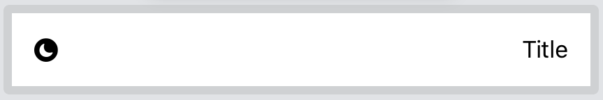
We can really return anything: what about turning our label into a HStack?
struct HStackLabelStyle: LabelStyle {
  func makeBody(configuration: Configuration) -> some View {
    HStack {
      configuration.icon
      Spacer()
      configuration.title
    }
  }
}

extension LabelStyle where Self == HStackLabelStyle {
  public static var hStack: HStackLabelStyle {
    HStackLabelStyle()
  }
}
And here we use it as any other Label:
Label("Title", systemImage: "moon.circle.fill")
  .labelStyle(.hStack)
While this works, this is the perfect opportunity to point out that .labelStyle modifiers work only if they're applied to a Label:
since HStackLabelStyle doesn't return a Label, any other label style applied, including erasing ones, will be ignored.
Label("Title", systemImage: "moon.circle.fill")
  .labelStyle(.hStack)
  .labelStyle(.shadow)
  .labelStyle(.iconOnly)
However, applying them before HStackLabelStyle would work:
Label("Title", systemImage: "moon.circle.fill")
  .labelStyle(.shadow)
  .labelStyle(.iconOnly)
  .labelStyle(.hStacl)
Note that if we don't return a Label within a LabelStyle, we probably shouldn't use Label in the first place.
Accessible Labels
While LabelStyle is mainly thought of for adding new styles, we can also use it to make our Labels more accessible.
For example, when the system content size is among the accessibility ones, we might want to strip any Label effect and hide the icon, leaving the bare minimum necessary for the user to go on with their task.
This is a great example where LabelStyle excels, along with our conditional modifier extension:
struct AccessibleLabelStyle: LabelStyle {
  @Environment(\.sizeCategory) var sizeCategory: ContentSizeCategory

  func makeBody(configuration: Configuration) -> some View {
    Label(configuration)
      .if(sizeCategory.isAccessibilityCategory) { $0.labelStyle(.titleOnly) }
  }
}
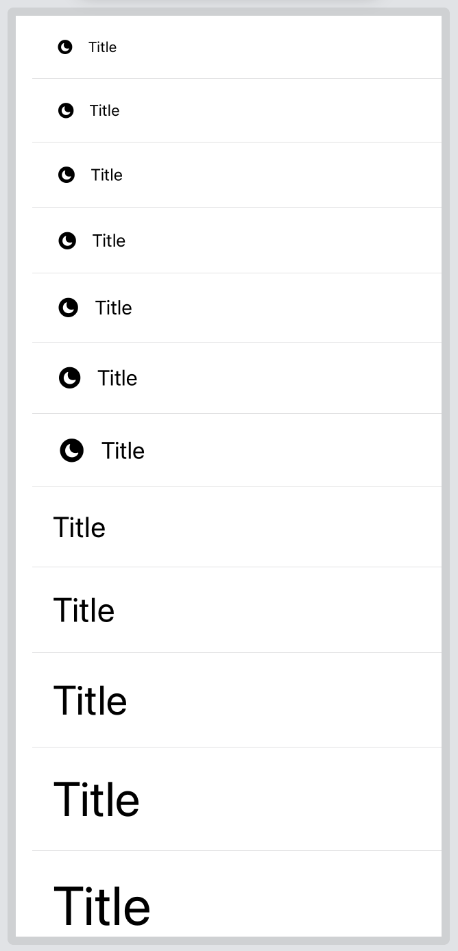
Here's an example with all possible content sizes:
Label Extensions
Despite label styles being the main way to customize and standardize our labels, sometimes we can get away by creating a Label extension instead.
For example, among SF Symbols updates this year, we've gained color variants for some of them:
Unfortunately, Label defaults to display the mono color variant with no way to change it out of the box.
This can be addressed via Label extension:
extension Label where Title == Text, Icon == Image {
  init(_ title: LocalizedStringKey, colorfulSystemImage systemImage: String) {
    self.init {
      Text(title)
    } icon: {
      Image(systemName: systemImage)
        .renderingMode(.original)
    }
  }
}
Which we can use by replacing the systemImage argument name with colorfulSystemImage, for example:
Label("Title", colorfulSystemImage: "moon.circle.fill")
  .labelStyle(ShadowLabelStyle())
Conclusions
If I told you at the beginning of this article that you were about to read ~1500 words on Label, I bet you wouldn't believe me: it's just an icon and a text, right?
Label is another example of SwiftUI looking incredibly simple on the surface, but hiding lots of complexity and flexibility behind the scenes.
This shouldn't surprise us anymore: and yet here we are, wondering what else we can discover about SwiftUI, subscribe to the five star RSS feed for more SwiftUI content.
Thanks for reading and please let me know if I've missed anything!