An alternative to SwiftUI's stacks + Spacer combo
 @zntfdr
Apple has recently published some great new articles around building layouts with SwiftUI's stacks in various situations.
There's no doubt that these articles showcase best practices/approaches on how to build views, and everybody should definitely make sure to read all of them.
In this article I would like to propose/highlight another pattern that I use daily, which is an alternative to Apple's Building Layouts with Stack Views article.
Overlay & background
When building a view with some components underneath/on top, instead of a ZStack we should use the overlay(_:alignment:) or background(_:alignment:) view modifiers on top of the main view, here it is in Apple's words:
If your layout has one dominant view that defines the size of the layout, use the
overlay(_:alignment:)orbackground(_:alignment:)view modifier on that view.
A view defined within these modifiers will get a proposed size as big as the dominant view, and by default will be put in the middle of it, for example:
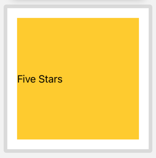
struct ContentView: View {
  var body: some View {
    Color.yellow
      .frame(width: 200, height: 200)
      .overlay(Text("Five Stars"))
  }
}

Let's say that we would like Text to be put on the leading side of the dominant view instead, an easy way to do so is to embed the Text in a HStack and then use a Spacer to push the text to the preferred side:
struct ContentView: View {
  var body: some View {
    Color.yellow
      .frame(width: 200, height: 200)
      .overlay(
        HStack {
          Text("Five Stars")
          Spacer()
        }
      )
  }
}
While this works great, there's a more concise way to declare the same layout thanks to the alignment parameter available on both overlay(_:alignment:) and background(_:alignment:):
struct ContentView: View {
  var body: some View {
    Color.yellow
      .frame(width: 200, height: 200)
      .overlay(Text("Five Stars"), alignment: .leading)
  }
}
With this definition we've managed to remove five lines of code (our entire body is now three lines long!) while obtaining the exact same layout, no compromises.
This approach is recommended and showcased in Apple's article as well.
Frame
Imagine now to not be on a container like overlay(_:alignment:) or background(_:alignment:), but where we would still like to put our content on the leading side of the available space, in this case Apple's recommended way is to use HStack + Spacer:
struct ContentView: View {
  var body: some View {
    HStack {
      Text("Five Stars")
      Spacer()
    }
  }
}

This works great, it's Apple's blessed way, and the layout is very clear.
However, when putting just a single element inside the stack, I prefer to use the .frame(...) view modifier instead:
struct ContentView: View {
  var body: some View {
    Text("Five Stars")
      .frame(maxWidth: .infinity, alignment: .leading)
  }
}
By setting either maxWidth or maxHeight to .infinity, we're telling SwiftUI that this view will take as much space as available on the associated axis, and then put the frame content (the Text in our example) according to the declared alignment argument.
In short we're using frame to create a new container and use its alignment to move the content, all while halving our view definition (our body went from 4 to 2 lines of code).
I see this as an equivalent approach to Apple's suggested way for .overlay(...) and .background(...), just for views without containers.
Other advantages of this approach:
- no need to define multiple stacks in complex layouts
- easier to animate alignment changes (e.g. from
.leadingto.trailing) - less views definitions (no stacks and
Spacers!)
When to use stack + Spacer then?
I believe the stack + Spacer combo is best used when we're distributing multiple components within the same stack, for example:
struct ContentView: View {
  var body: some View {
    HStack {
      Text("Five")
      Spacer()
      Text("Stars")
    }
  }
}

In this case HStack + Spacer is the way to go: the .frame approach would have an hard time declaring this layout while also making sure that the two Text instances wouldn't overlap.
Conclusions
In this article we've covered an alternative approach on how to setup and distribute content in our SwiftUI layouts:
the outcome is exactly the same, which one you pick doesn't really matter as long as the choice stays consistent throughout your project.
Do you use any other alternatives? I'd love to know!
Thank you for reading and stay tuned for more articles!