Custom HUDs in SwiftUI
 @zntfdr
iOS has always had some kind of system HUD:
we can see one every time we send an email from the Mail.app, when we toggle iOS's Silent Mode, and in many other ways.
Unfortunately, beside for accessibility, iOS has yet to open an API for developers to display those HUDs at will (FB6534210).
Fortunately, Apple has also brought us SwiftUI, which makes recreating such HUDs not too troublesome: in this article, let's see how we can build one ourselves!
The HUD
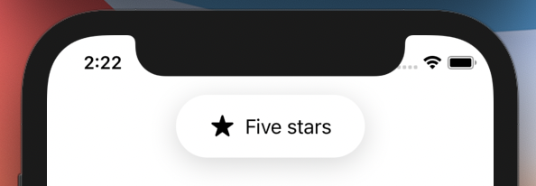
We will recreate the "Silent Mode" HUD (or the "airpods are connected" HUD, or..), for maximum flexibility we will let the developers input the HUD content, while the HUD definition will take care of the shape and shadow:
struct HUD<Content: View>: View {
  @ViewBuilder let content: Content

  var body: some View {
    content
      .padding(.horizontal, 12)
      .padding(16)
      .background(
        Capsule()
          .foregroundColor(Color.white)
          .shadow(color: Color(.black).opacity(0.16), radius: 12, x: 0, y: 5)
      )
  }
}
For example we can create the preview above with:
HUD {
  Label("Five stars", systemImage: "star.fill")
}
Great! Now that we have our design, let's add it in a view and implement its show/hide animation.
Showing & hiding the HUD
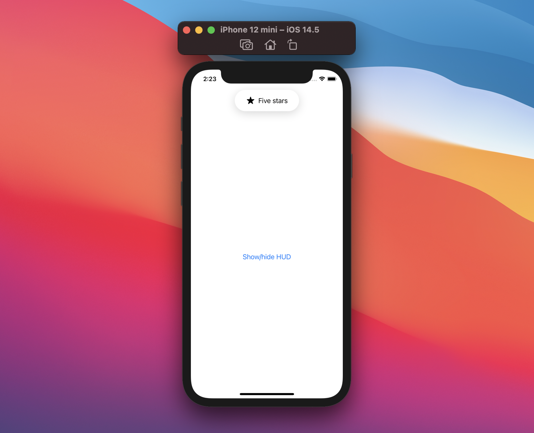
We will embed the HUD in a ZStack, where it will be the top-most element:
struct ContentView: View {
  var body: some View {
    ZStack(alignment: .top) {
      NavigationView {
        Button("Show/hide HUD") { }
      }

      HUD {
        Label("Five stars", systemImage: "star.fill")
      }
      .zIndex(1)
    }
  }
}
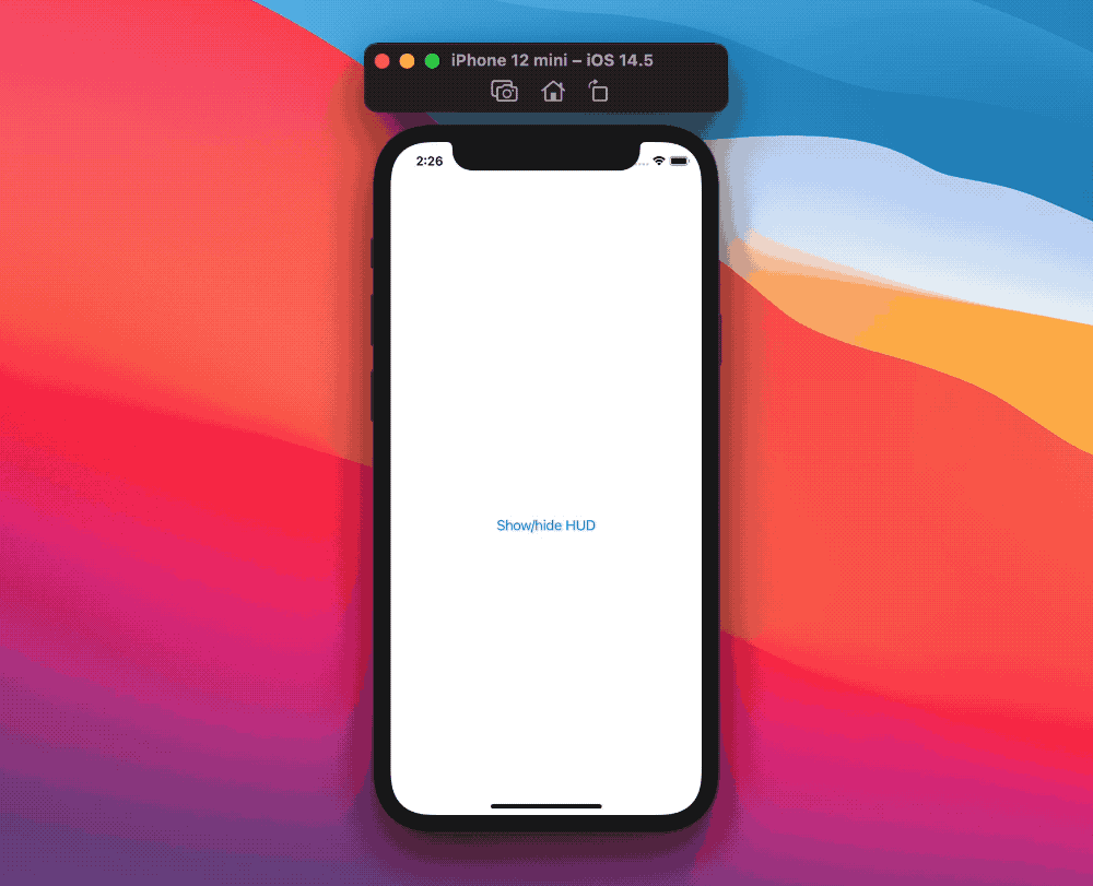
At this point we have our HUD always displayed, let's introduce a new state controlling whether the HUD is shown:
struct ContentView: View {
  @State private var showingHUD = false

  var body: some View {
    ZStack(alignment: .top) {
      NavigationView {
        Button("Show/hide HUD") {
          showingHUD.toggle()
        }
      }

      if showingHUD {
        HUD {
          Label("Five stars", systemImage: "star.fill")
        }
        .zIndex(1)
      }
    }
  }
}

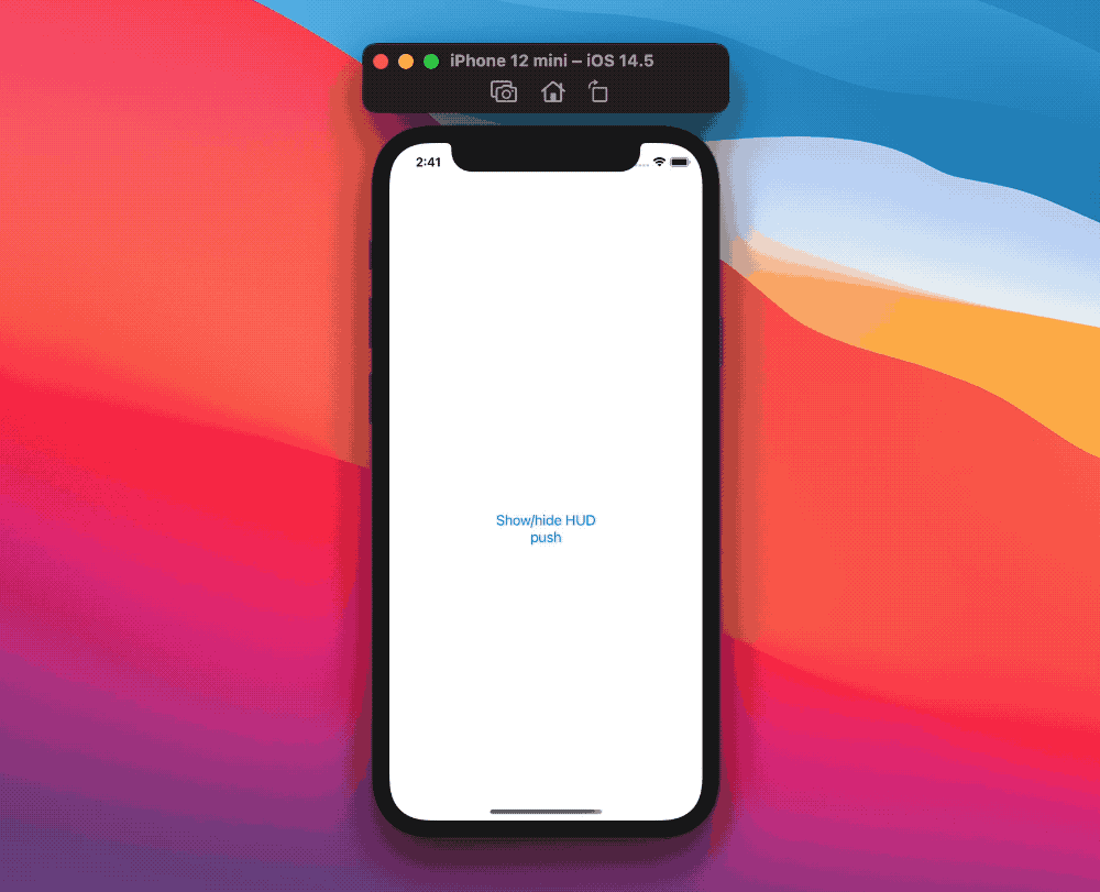
Great, this works, however we probably would like some fancier animation, we can achieve that by:
- using the
withAnimationmodifier in the button action - declaring a transition where we display our HUD from the top of the screen, along with the default opacity effect
Lastly, the HUD needs to have an automatic dismissal after a few seconds, we can trigger so by adding a countdown via the onAppear modifier:
struct ContentView: View {
  @State private var showingHUD = false

  var body: some View {
    ZStack(alignment: .top) {
      NavigationView {
        Button("Show/hide HUD") {
          withAnimation {
            showingHUD.toggle()
          }
        }
      }

      if showingHUD {
        HUD {
          Label("Five stars", systemImage: "star.fill")
        }
        .transition(AnyTransition.move(edge: .top).combined(with: .opacity))
        .onAppear {
          DispatchQueue.main.asyncAfter(deadline: .now() + 3) {
            withAnimation {
              showingHUD = false
            }
          }
        }
        .zIndex(1)
      }
    }
  }
}
From the user point of view, this is so much better! However our relatively simple view code is now overwhelmed with HUD logic, let's tackle that by creating a new hud view modifier:
extension View {
  func hud<Content: View>(
    isPresented: Binding<Bool>,
    @ViewBuilder content: () -> Content
  ) -> some View {
    ZStack(alignment: .top) {
      self

      if isPresented.wrappedValue {
        HUD(content: content)
          .transition(AnyTransition.move(edge: .top).combined(with: .opacity))
          .onAppear {
            DispatchQueue.main.asyncAfter(deadline: .now() + 3) {
              withAnimation {
                isPresented.wrappedValue = false
              }
            }
          }
          .zIndex(1)
      }
    }
  }
}
Thanks to this new definition our main view declaration focuses solely on the actual content:
struct ContentView: View {
  @State private var showingHUD = false

  var body: some View {
    NavigationView {
      Button("Show/hide HUD") {
        withAnimation {
          showingHUD.toggle()
        }
      }
    }
    .hud(isPresented: $showingHUD) {
      Label("Five stars", systemImage: "star.fill")
    }
  }
}
Note how we've put the .hud(isPresented:content:) view modifier on top of NavigationView, meaning that our HUD will persist even when navigating multiple screens:
App-wise HUD
Since the HUD content is a parameter, it can be swapped whenever we please. This is especially useful if we would like our app to have a global HUD:
thanks to this dynamicity we can create an environment object for our HUD, and only views that need or want to trigger the HUD will reach for it.
For example let's make it possible to change both the title and the image of our HUD Label, we do so by creating a new HUDState ObservableObject:
final class HUDState: ObservableObject {
  @Published var isPresented: Bool = false
  var title: String = ""
  var systemImage: String = ""
}
Then we move our .hud(isPresented:content:) modifier to the App level (or the SceneDelegate if we're still using the UIKit life cycle), along with the new state:
@main
struct RatingApp: App {
  @StateObject var hudState = HUDState()

  var body: some Scene {
    WindowGroup {
      ContentView()
        .environmentObject(hudState)
        .hud(isPresented: $hudState.isPresented) {
          Label(hudState.title, systemImage: hudState.systemImage)
        }
    }
  }
}
At this point HUDState is part of the environment, which makes it possible to trigger the HUD from any view, for example, we can go back to our original view and update it with these new changes:
struct ContentView: View {
  @EnvironmentObject var hudState: HUDState

  var body: some View {
    NavigationView {
      Button("Show/hide HUD") {
        hudState.title = "Five stars"
        hudState.systemImage = "star.fill"
        withAnimation {
          hudState.isPresented.toggle()
        }
      }
    }
  }
}
There's still room for improvement at call site, as the developer may forget to update the hud image for example, or to wrap the isPresented change within withAnimation.
To avoid such scenarios, instead of asking developers to manually change each parameter by themselves, we can let them trigger the HUD via a convenience show(title:systemImage:) function:
final class HUDState: ObservableObject {
  @Published var isPresented: Bool = false
  private(set) var title: String = ""
  private(set) var systemImage: String = ""

  func show(title: String, systemImage: String) {
    self.title = title
    self.systemImage = systemImage
    withAnimation {
      isPresented = true
    }
  }
}
Going back to our original view:
struct ContentView: View {
  @EnvironmentObject private var hud: HUDState

  var body: some View {
    NavigationView {
      Button("Show/hide HUD") {
        hud.show(title: "Five stars", systemImage: "star.fill")
      }
    }
  }
}
Now we truly have a global HUD and almost no HUD logic if not the bare minimum to trigger it from any view. Of course there's still room for improvements (you win Internet points if you spot some of these and let me know), however this is already a good setup.
The final gist, both for the local and global example, can be found here.
Conclusions
HUDs have been part of the iOS visual language for many years, while we don't have access to the native ones, SwiftUI lets us create elegant solutions that can go well beyond what a system API would ever offer.
While we focused on just one kind of HUD, the same flow can be applied to any other kind, and can even be applied for custom alerts, and much more.
Do you display HUDs in your apps? What approach do you use? Please let me know!
Thank you for reading and stay tuned for more articles!