SwiftUI keyboard avoidance
One of the things I was most surprised with when starting my iOS career was the lack of a baked-in, system-wide keyboard avoidance:
every app needs to show a keyboard at some point, and every app has to either re-invent the wheel or pick one of the de-facto standard open source solutions out there.
Fortunately, in iOS 14, SwiftUI ends it all by gaining automatic keyboard avoidance.
In this article, let's have a rundown on how to manage this long-awaited, very welcome feature.
Opting-out
This feature is opt-out, meaning it's on by default.
Unlike for system appearances (a.k.a dark/light mode), there's no way to entirely opt out of this feature via an info.plist key (FB8756741), instead, we will need to use the new ignoresSafeArea(_:edges:) view modifier when needed:
var body: some View {
  myView
    .ignoresSafeArea(.keyboard)
}
More examples below.
However I recommend against this and to embrace SwiftUI's new feature:
let the SwiftUI team deal with it, while we can focus on delivering the best app to our users!
iOS 13 compatibility
As this is an iOS 14+ feature, we still need to implement our own keyboard avoidance when/if targeting iOS 13.
This is mostly a matter of enabling the custom/3rd-party keyboard avoidance only on iOS 13:
if #available(iOS 14.0, *) {
  // do nothing, use SwiftUI's keyboard avoidance.
} else {
  // enable custom/3rd-party keyboard avoidance.
}
To be found in your app/scene delegate.
How keyboard avoidance works
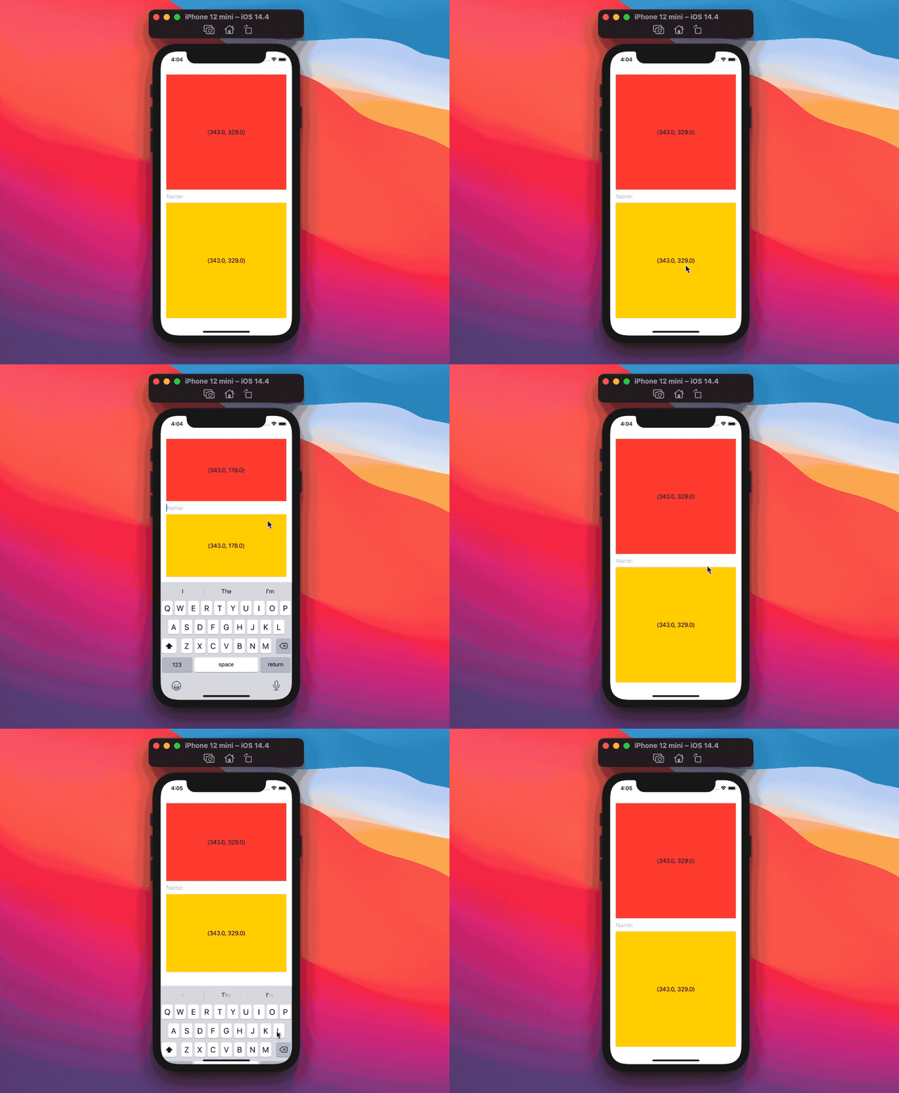
Every device has a safe area: when a system keyboard is shown, this safe area will grow, reducing the space proposed to our SwiftUI views, which will need to compress in order to make room for the keyboard.
In the following example we can see how activating the TextField compresses the colors heights:
struct ContentView: View {
  @State private var redSize: CGSize = .zero
  @State private var yellowSize: CGSize = .zero
  @State private var name: String = ""

  var body: some View {
    VStack {
      Color.red
        .overlay(Text(verbatim: "\(redSize)"))
        .readSize {
          redSize = $0
        }

      TextField("Name:", text: $name)

      Color.yellow
        .overlay(Text(verbatim: "\(yellowSize)"))
        .readSize {
          yellowSize = $0
        }
    }
    .padding()
  }
}
We're using our
.readSize(onChange:)view modifier to get the child view size.
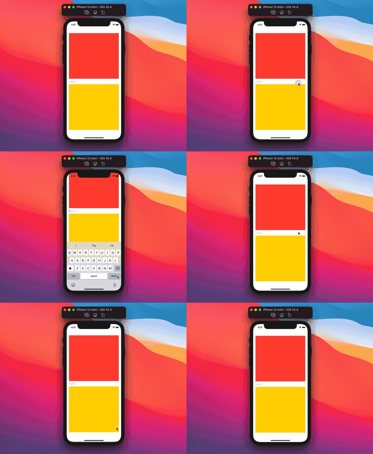
This is possible because we had two "compressible" views (our colors), if all views are not flexible, then SwiftUI will shift the whole view up:
struct ContentView: View {
  @State private var name: String = ""

  var body: some View {
    VStack {
      Color.red
        .frame(height: 314)

      TextField("Name:", text: $name)

      Color.yellow
        .frame(height: 314)
    }
    .padding()
  }
}
This happens because our view height exceeds the parent proposed size:
in these situations SwiftUI will center our view in the middle of the available area, and our view will vertically leak this area both at the bottom and at the top.
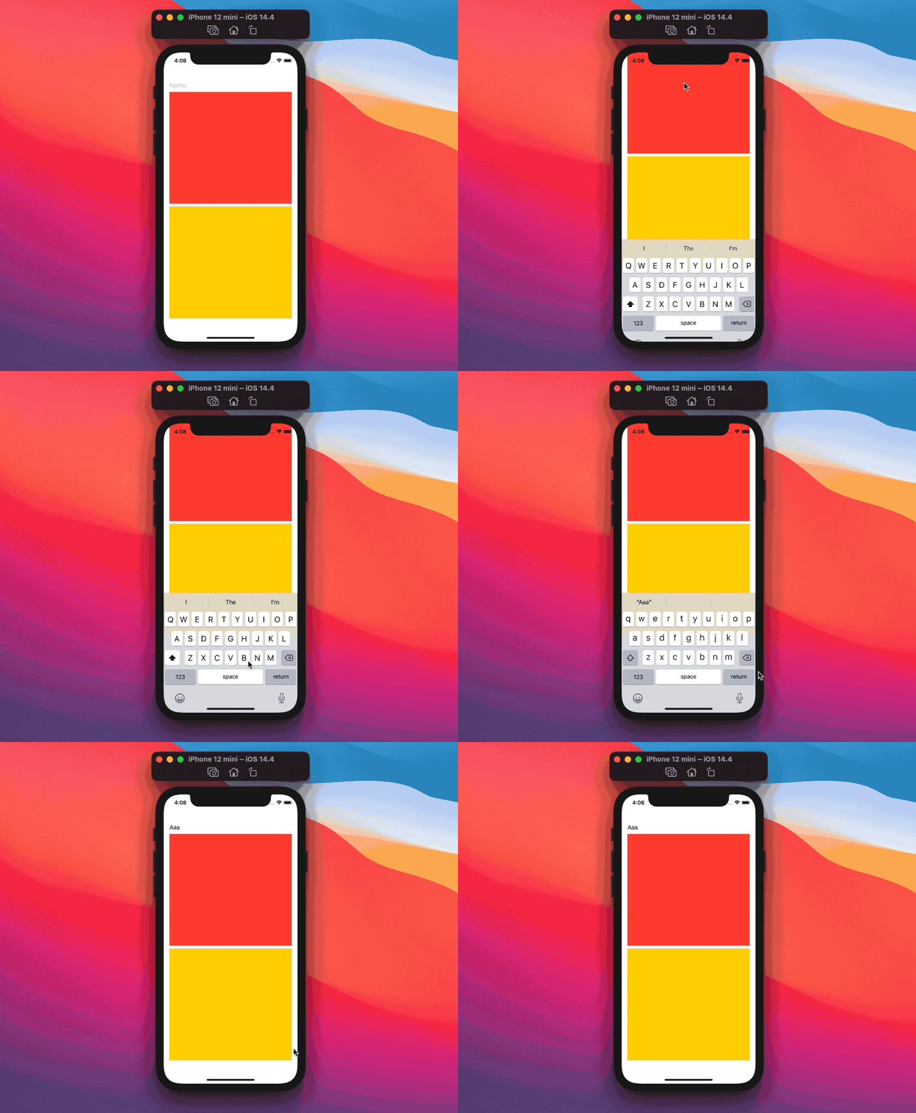
What if we move the text field to the top of the colors?
struct ContentView: View {
  @State private var name: String = ""

  var body: some View {
    VStack {
      TextField("Name:", text: $name)

      Color.red
        .frame(height: 314)

      Color.yellow
        .frame(height: 314)
    }
    .padding()
  }
}
Wops, the text field is completely hidden!
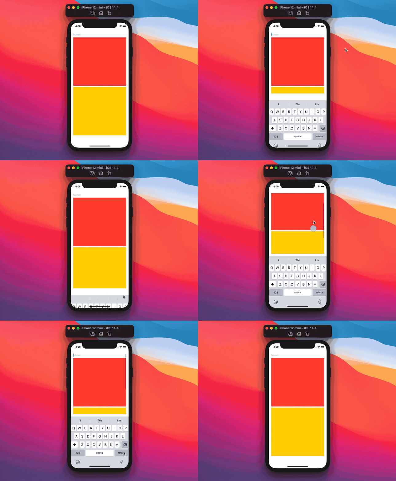
The easiest (and recommended) solution is to use wrap our views in a scroll view (ScrollView, List, Form) instead of a VStack:
struct ContentView: View {
  @State private var name: String = ""

  var body: some View {
    ScrollView {
      TextField("Name:", text: $name)

      Color.red
        .frame(height: 314)

      Color.yellow
        .frame(height: 314)
    }
    .padding()
  }
}
Scroll views, as we've seen before, are composed by two layers:
- a frame layer, used to position the scroll view itself in the view hierarchy
- a "scrollable" content layer, where all its content is placed
When a keyboard is shown, only the frame layer is affected, our content (TextField and colors) is not.
SwiftUI manages the scroll view offset for us, and it will make sure that our text input is visible, regardless of where it is located:
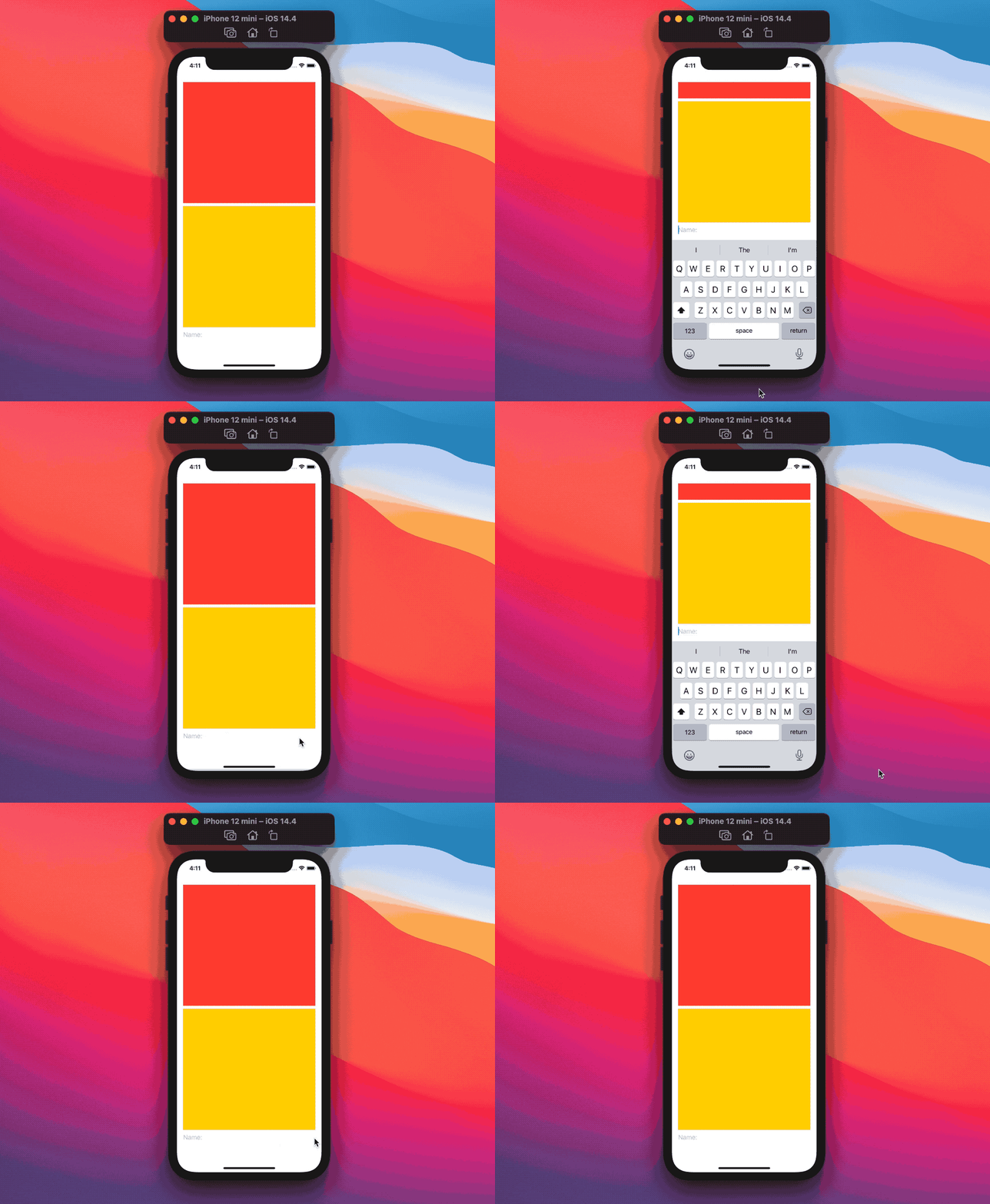
struct ContentView: View {
  @State private var name: String = ""

  var body: some View {
    ScrollView {
      Color.red
        .frame(height: 314)

      Color.yellow
        .frame(height: 314)

      TextField("Name:", text: $name)
    }
    .padding()
  }
}
Ignoring the keyboard
Let's say that, for some reason we don't want our view to move when the keyboard shows up, going back to our original example we can add the view modifier .ignoresSafeArea(.keyboard) and it will work as expected:
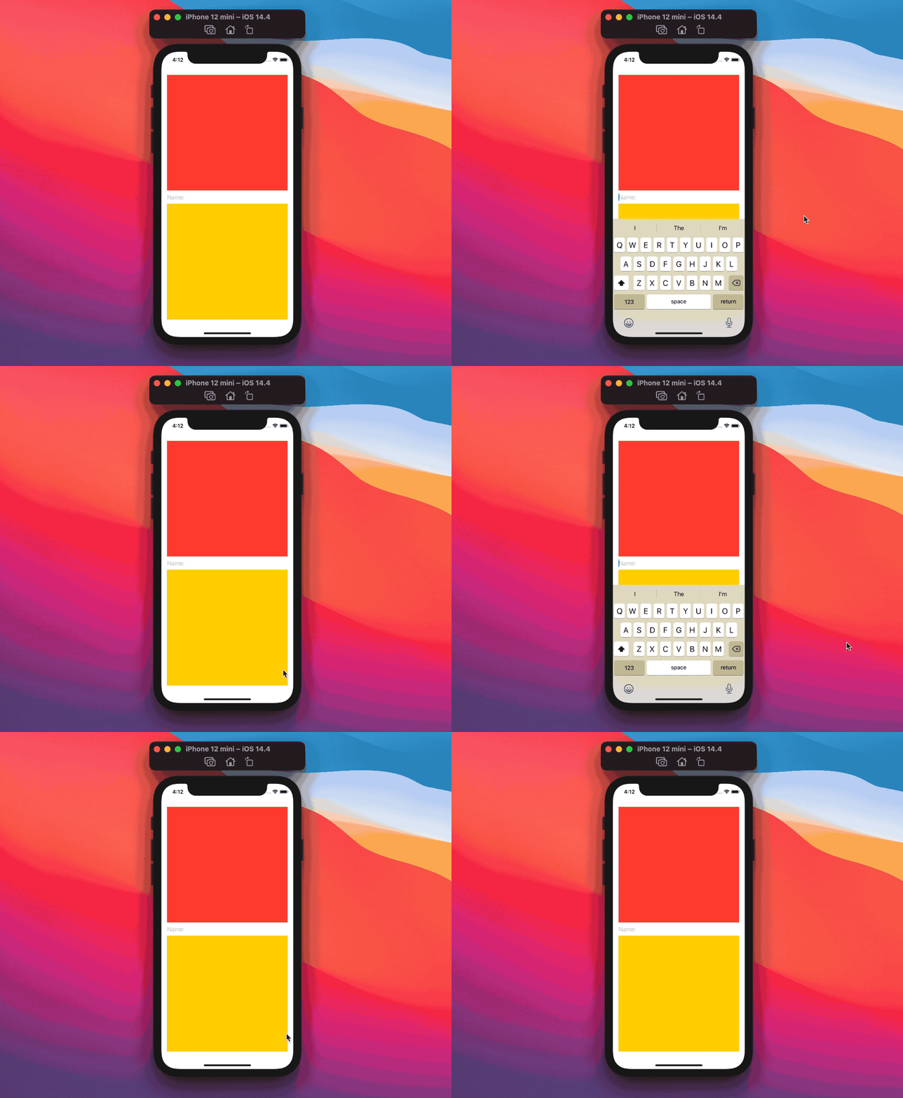
struct ContentView: View {
  @State private var name: String = ""

  var body: some View {
    VStack {
      Color.red

      TextField("Name:", text: $name)

      Color.yellow
    }
    .padding()
    .ignoresSafeArea(.keyboard)
  }
}
If we make all our views heights not flexible, the whole view will shift up once again, despite .ignoresSafeArea(.keyboard) being there:

struct ContentView: View {
  @State private var name: String = ""

  var body: some View {
    VStack {
      Color.red
        .frame(height: 314)

      TextField("Name:", text: $name)

      Color.yellow
        .frame(height: 314)
    }
    .padding()
    .ignoresSafeArea(.keyboard)
  }
}
After some experimentation it seems like SwiftUI shifts the view up when the view body has not enough compressible vertical space:
in other words, if our content height cannot be reduced to accommodate the keyboard, .ignoresSafeArea(.keyboard) won't work.
If you figure out the right formula, please let me know!
In either case, no components will be actually compressed with .ignoresSafeArea(.keyboard):
the only difference is whether the view is shifted up or not.
The recommended way to avoid such issues is by using a scroll view, which makes the previous example work as expected:

struct ContentView: View {
  @State private var name: String = ""

  var body: some View {
    ScrollView {  // this is now a ScrollView instead of a VStack.
      Color.red
        .frame(height: 314)

      TextField("Name:", text: $name)

      Color.yellow
        .frame(height: 314)
    }
    .padding()
    .ignoresSafeArea(.keyboard)
  }
}
Conclusions
Avoiding the keyboard is something pretty much every iOS developer has had to deal with at some point, thanks to iOS 14 and SwiftUI this is now a thing of the past, allowing us developers to focus even more on app features instead.
Have you found the transition to iOS 14 smooth? Any pitfalls? Please let me know!
Thank you for reading and stay tuned for more articles.
 @zntfdr