Exploring SwiftUI's Button styles
Button is no doubt one of the most popular SwiftUI elements, it's also very special, as it is the only component with two different style protocols: ButtonStyle and PrimitiveButtonStyle.
In this article, let's explore everything there's to know about button styling, and more.
As usual the focus is on iOS, the same concepts can be applied to all platforms with little change.
Starting up
SwiftUI comes with three built-in styles: DefaultButtonStyle, BorderlessButtonStyle, and PlainButtonStyle.
When declaring a simple button, DefaultButtonStyle is applied:
Button("Simple button") {
  // button tapped
  ...
}

DefaultButtonStyle is not a style per se: it's our way to let SwiftUI pick the style for us (based on the context, platform, parent views, and more).
The actual default style is BorderlessButtonStyle, which applies a blue tint on top of our button, or the app accent color if we're on iOS 14, along with some visual effects when tapped, focused, etc.
Unless we are in an exception (I haven't found one yet, please let me know if you do), the following three declarations are equivalent:
Button("Simple button") {
  ...
}

Button("Simple button") {
  ...
}
.buttonStyle(DefaultButtonStyle())

Button("Simple button") {
  ...
}
.buttonStyle(BorderlessButtonStyle())

In iOS 13 the (blue) tint is applied to images declared within our button
label, to avoid so we need to either add a rendering modifier to our images (e.g.Image("image").renderingMode(.original)) or declare the proper rendering in the image asset catalog.From iOS 14 only template images will be tinted by default.
Lastly, SwiftUI offers PlainButtonStyle, which displays the button label without a tint, but still applies visual effects in different states:
Button("Plain style button") {
  // button tapped
  ...
}
.buttonStyle(PlainButtonStyle())

These are all the styles SwiftUI provides us in iOS: thankfully we can create new ones with ButtonStyle and PrimitiveButtonStyle, let's start with ButtonStyle.
ButtonStyle
The documentation suggests us to use ButtonStyle when we're declaring the button appearance ourselves, but the button interaction behaves as any other standard button (a.k.a. its action is triggered when tapped).
public protocol ButtonStyle {
  associatedtype Body: View

  func makeBody(configuration: Self.Configuration) -> Self.Body

  typealias Configuration = ButtonStyleConfiguration
}
The only requirement of ButtonStyle is to return a view from makeBody(configuration:), the function takes in a ButtonStyleConfiguration instance:
public struct ButtonStyleConfiguration {
  public let label: ButtonStyleConfiguration.Label
  public let isPressed: Bool
}
This configuration comes with two properties:
labelis the buttonlabel, for example if our button isButton(action: {}, label: { Text("Hello world") }), thenText("Hello world")will be ourlabel
isPressedis the current state of the button, which can be used inButtonStyle'smakeBody(configuration:)for visual effects
Let's define a few examples:
struct RoundedRectangleButtonStyle: ButtonStyle {
  func makeBody(configuration: Configuration) -> some View {
    HStack {
      Spacer()
      configuration.label.foregroundColor(.black)
      Spacer()
    }
    .padding()
    .background(Color.yellow.cornerRadius(8))
    .scaleEffect(configuration.isPressed ? 0.95 : 1)
  }
}

struct ShadowButtonStyle: ButtonStyle {
  func makeBody(configuration: Configuration) -> some View {
    configuration.label
      .shadow(
        color: configuration.isPressed ? Color.blue : Color.black,
        radius: 4, x: 0, y: 5
      )
  }
}

Note how these new buttons do not come with the default effects when tapped, focused, etc: it's now up to us to add such effects in out buttons.
This is all there is to know about ButtonStyle. It lets us customize any button appearance, the main advantages are:
- can apply the same style to multiple buttons without code duplication
- access to the
isPressedevent - keeps the standard interaction/behavior
Applying and composing multiple styles
Button doesn't have an initializer accepting a ButtonStyleConfiguration instance (FB8979053), making things complicated when composing multiple styles together.
As per our current declarations, applying multiple ButtonStyles has no effect, and only the closest style will be used (the makeBody(configuration:) of other styles won't even be called):
// Only RoundedRectangleButtonStyle is applied
Button("Rounded rectangle button style") {
  // button tapped
  ...
}
.buttonStyle(RoundedRectangleButtonStyle())
.buttonStyle(ShadowButtonStyle())
.buttonStyle(BorderlessButtonStyle())
.buttonStyle(DefaultButtonStyle())

A "workaround" for this limitation is to return a new Button in our ButtonStyle makeBody(configuration:) function, for example we could update RoundedRectangleButtonStyle as following:
struct RoundedRectangleButtonStyle: ButtonStyle {
  func makeBody(configuration: Configuration) -> some View {
    Button(action: {}, label: {
      HStack {
        Spacer()
        configuration.label.foregroundColor(.black)
        Spacer()
      }
    })
    // 👇🏻 makes all taps go to the original button
    .allowsHitTesting(false)
    .padding()
    .background(Color.yellow.cornerRadius(8))
    .scaleEffect(configuration.isPressed ? 0.95 : 1)
  }
}
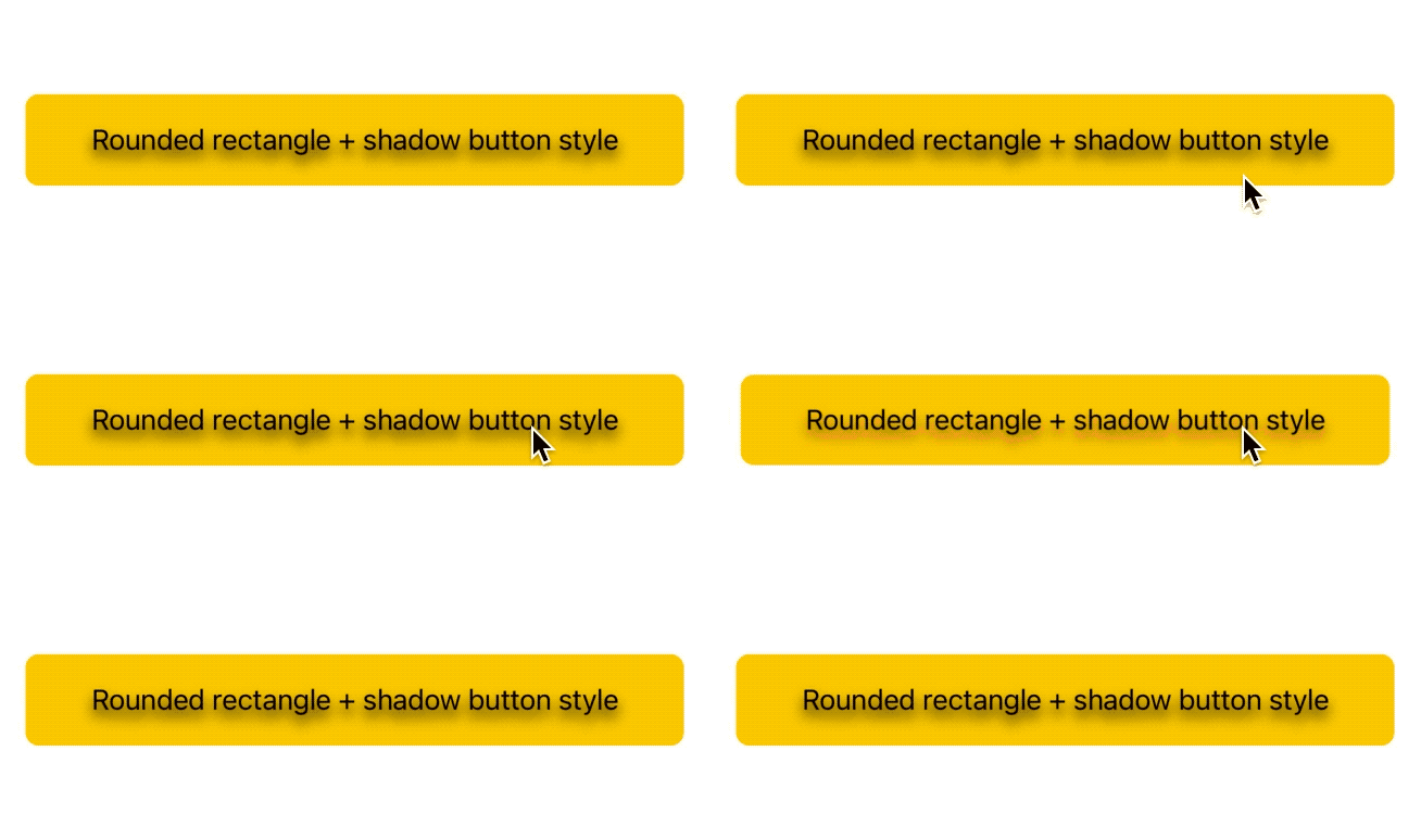
With this new definition the previous example almost works:
Button("Rounded rectangle + shadow button style") {
  // button tapped
  ...
}
.buttonStyle(RoundedRectangleButtonStyle())
.buttonStyle(ShadowButtonStyle())

The main drawback is that further styles are applied to fictitious and not tappable buttons, thus not receiving any isPressed events.
There are more advanced solutions for these drawbacks, but at this point we're fighting the framework:
instead, it's better to consider each .buttonStyle(..) as a complete override of previous ones.
An easy fix for such limitations, at least for the moment, is to create and use a new style which combines the desired effects, for example:
struct RoundedRectangleWithShadowedLabelButtonStyle: ButtonStyle {
  func makeBody(configuration: Configuration) -> some View {
    HStack {
      Spacer()
      configuration.label.foregroundColor(.black)
        .shadow(
          color: configuration.isPressed ? Color.red : Color.black,
          radius: 4, x: 0, y: 5
        )
      Spacer()
    }
    .padding()
    .background(Color.yellow.cornerRadius(8))
    .scaleEffect(configuration.isPressed ? 0.95 : 1)
  }
}
Which we can use as following:
Button("Rounded rectangle + shadow button style") {
  // button tapped
  ...
}
.buttonStyle(RoundedRectangleWithShadowedLabelButtonStyle())

A kind reminder that this is a technical article, not a design article.
PrimitiveButtonStyle
While ButtonStyle was all about customizing the appearance and keeping the standard interaction behavior, PrimitiveButtonStyle lets us customize both, meaning that it's up to us to define the button appearance and to decide when and how to trigger the button action.
The PrimitiveButtonStyle definition is nearly identical to ButtonStyle:
public protocol PrimitiveButtonStyle {
    associatedtype Body : View

    func makeBody(configuration: Self.Configuration) -> Self.Body

    typealias Configuration = PrimitiveButtonStyleConfiguration
}
The only difference stands in the makeBody(configuration:) parameter, which is now a PrimitiveButtonStyleConfiguration type:
public struct PrimitiveButtonStyleConfiguration {
  public let label: PrimitiveButtonStyleConfiguration.Label
  public func trigger()
}
This configuration once again comes with the button label as a property, however isPressed is now replaced by a trigger() function:
invoking trigger() is how we call the button action, and it's now up to us to define the right time to do so.
For example, if we would like a button to trigger only when double tapped, we could define the following style:
struct DoubleTapOnlyStyle: PrimitiveButtonStyle {
  func makeBody(configuration: Configuration) -> some View {
    configuration.label
      .onTapGesture(count: 2, perform: configuration.trigger)
  }
}
Which we can then use like any other style:
Button("Double tap me") {
  // button double tapped
  ...
}
.buttonStyle(DoubleTapOnlyStyle())

Applying and composing multiple (primitive) styles
Unlike for ButtonStyleConfiguration, Button does have an initializer accepting a PrimitiveButtonStyleConfiguration instance, allowing us to compose/apply multiple (primitive) styles to the same button.
For example, consider the following styles:
// The button action triggers on double taps.
struct DoubleTapStyle: PrimitiveButtonStyle {
  func makeBody(configuration: Configuration) -> some View {
    Button(configuration) // <- Button instead of configuration.label
      .onTapGesture(count: 2, perform: configuration.trigger)
  }
}

// The button action triggers on swipes.
// (even when terminated outside the button)
struct SwipeButtonStyle: PrimitiveButtonStyle {
  func makeBody(configuration: Configuration) -> some View {
    Button(configuration)
      .gesture(
        DragGesture()
          .onEnded { _ in
            configuration.trigger()
          }
      )
  }
}
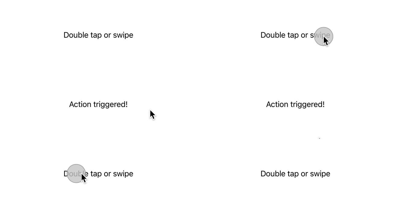
As each style returns a button, they can be combined and work together no problem:
Button(
  "Double tap or swipe",
  action: {
    // handle action here
    ...
  }
)
.buttonStyle(DoubleTapStyle())
.buttonStyle(SwipeButtonStyle())
There's a small side-effect of this approach:Button(configuration) comes with the default button interaction and style, thankfully we can remove both of these by defining yet another "plain" style.
struct PlainNoTapStyle: PrimitiveButtonStyle {
  func makeBody(configuration: Configuration) -> some View {
    Button(configuration)
      .buttonStyle(PlainButtonStyle()) // removes any default appearance
      .allowsHitTesting(false)         // no more triggers on taps
      .contentShape(Rectangle())       // let other interactions work
  }
}
If we now add this style to our button definition, we will truly make it work with just double taps and swipes:
Button(
  "Double tap or swipe",
  action: {
    // handle action here
    ...
  }
)
.buttonStyle(DoubleTapStyle())
.buttonStyle(SwipeButtonStyle())
.buttonStyle(PlainNoTapStyle())

However we'd probably want to keep the single tap default interaction enabled to most buttons.
Using PrimitiveButtonStyle and ButtonStyle
We've covered how each ButtonStyle can be considered a complete override of previous styles, while PrimitiveButtonStyle allows us to compose multiple styles (when defined correctly), what about combining the two?
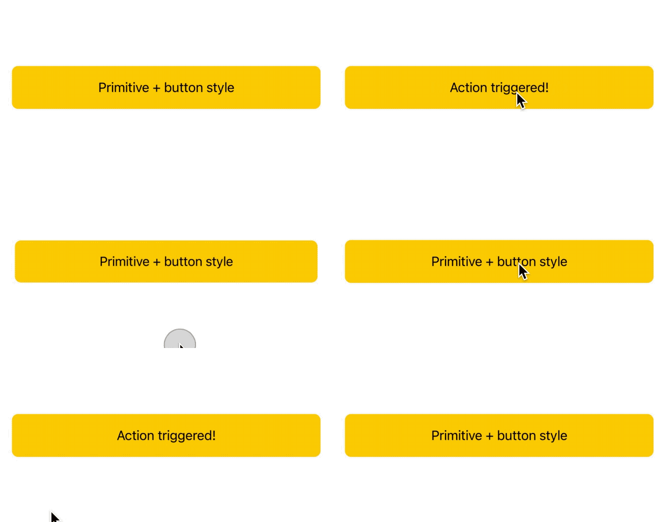
We can apply and have active both a ButtonStyle and (multiple) PrimitiveButtonStyle at the same time, for example:
Button(
  "Primitive + button style",
  action: {
    // handle action here
    ...
  }
)
// 👇🏻 triggers the button even when dragging our finger out of the button
.buttonStyle(SwipeButtonStyle())
.buttonStyle(RoundedRectangleButtonStyle())

In these situations it's important to have the ButtonStyle (RoundedRectangleButtonStyle above) declared last, as otherwise it would erase the PrimitiveButtonStyle as well.
Note that our ButtonStyle will only receive the isPressed event on the standard tap gesture, it won't know when the button action is triggered thanks to any other PrimitiveButtonStyle: it's our duty to define any visual clue on those styles when/if needed.
Conclusions
Buttons are the SwiftUI component with the simplest interaction: tap to trigger them.
In this article we've seen how we can turn any button into much more advanced elements with completely different appearances and gestures:
we won't need to go beyond a custom ButtonStyle most of the time, but it's always good to know that more powerful tools are there when needed.
Have you ever extended a button interaction? What other uses/needs do you see for such styles? Please let me know!
Thank you for reading and stay tuned for more articles.
 @zntfdr