Lazy stacks secrets
A couple of weeks ago, I updated AStack, a micro-library that switches any SwiftUI stack axis when the environment content size category is among the accessibility ones.
In doing so, I've noticed something that I missed before: lazy stacks initializers offer a pinnedViews parameter, which is suspiciously identical to what lazy grids offer.
This discovery made me think of two articles from the great PSPDFKit blog, highlighting how Apple is moving away from table views and going all-in with collections:
image having this knowledge and being responsible for building a brand new UI framework. You certainly wouldn't repeat history, would you?
In this article, let's compare lazy stacks with their counterpart, lazy grids.
We will focus on the vertical variant of these views: the same concepts are equivalent to the horizontal ones.
Definitions
The following definitions come from the official documentation:
LazyVStack: A view that arranges its children in a line that grows vertically, creating items only as neededLazyVGrid: A container view that arranges its child views in a grid that grows vertically, creating items only as needed
We've just read the same sentence twice:
- the second half of the definitions is an exact match, word for word
- the first half varies slightly:
LazyVStackarranges its children in a line that grows vertically, whileLazyVGridarranges its children in a grid that grows vertically
The difference is clear:
one is a grid, and the other is a line (or, dare I say, a column). Everything else is identical.
Initializers
Here are the initializers:
public struct LazyVStack<Content: View>: View {
  public init(
    alignment: HorizontalAlignment = .center,
    spacing: CGFloat? = nil,
    pinnedViews: PinnedScrollableViews = .init(),
    @ViewBuilder content: () -> Content
  )
}

public struct LazyVGrid<Content: View>: View {
  public init(
    columns: [GridItem],
    alignment: HorizontalAlignment = .center,
    spacing: CGFloat? = nil,
    pinnedViews: PinnedScrollableViews = .init(),
    @ViewBuilder content: () -> Content
  )
}
Once again, a near-exact match:
the only difference is an extra parameter on LazyVGrid, columns, where we pass the grid column configuration, telling SwiftUI how many columns we would like and their size.
For an in-depth look at grids and how they work, please refer to this great article by Javier Nigro.
Making LazyVGrid mock LazyVStack
We've seen how, on the surface, these views are nearly identical. Observing how LazyVStack behaves in practice, it's similar to a grid with one column, a.k.a. a flexible size GridItem: what if this is really it?
We now define LazyVStackMock, a view that matches this exact definition:
public struct LazyVStackMock<Content: View>: View {
  let alignment: HorizontalAlignment
  let spacing: CGFloat?
  let pinnedViews: PinnedScrollableViews
  let content: Content

  public init(
    alignment: HorizontalAlignment = .center,
    spacing: CGFloat? = nil,
    pinnedViews: PinnedScrollableViews = .init(),
    @ViewBuilder content: () -> Content
  ) {
    self.alignment = alignment
    self.spacing = spacing
    self.pinnedViews = pinnedViews
    self.content = content()
  }

  public var body: some View {
    LazyVGrid(
      columns: [GridItem(.flexible())],
      alignment: alignment,
      spacing: spacing,
      pinnedViews: pinnedViews,
      content: { content }
    )
  }
}
LazyVStackMock's body is aLazyVGridwith one column flexible sizeGridItem
Comparing LazyVStack with LazyVStackMock
Did we just reinvent LazyVStack? This is our testing ground:
struct ContentView: View {
  var body: some View {
    HStack {
      LazyVStack {
          Section(header: header(title: "Original")) { content }
      }
      LazyVStackMock {
          Section(header: header(title: "Mock")) { content }
      }
    }
    .font(.title)
  }

  var content: some View {
    ForEach(1...10, id: \.self) { count in
      Label("Placeholder \(count)", colorfulSystemImage: "leaf.fill")
    }
  }

  func header(title: String) -> some View {
    Text(verbatim: title)
      .bold()
      .padding(.horizontal)
      .padding(.vertical, 4)
      .foregroundColor(.white)
      .background(
        Capsule().foregroundColor(.green)
      )
  }
}
We're using the
Labelextension introduced in last week's article
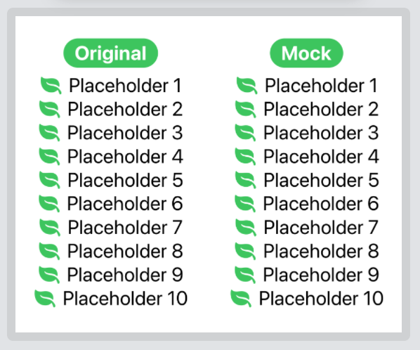
If we run the test as is, we will have an identical result.
Let's see what happens if we specify other parameters:
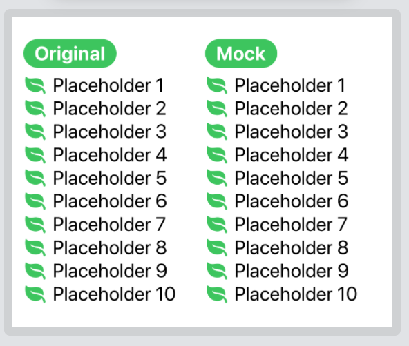
- Alignment (we add
alignment: .leading)
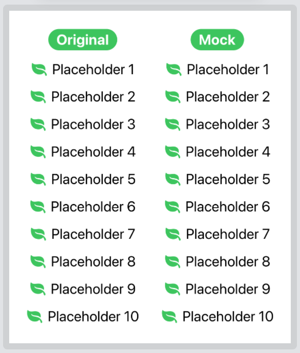
- Spacing (we add
spacing: 20)
- Pinned views (we add
pinnedViews: [.sectionHeaders])

We still have a match even if we add everything together, put each stack in a ScrollView, and add several more items:
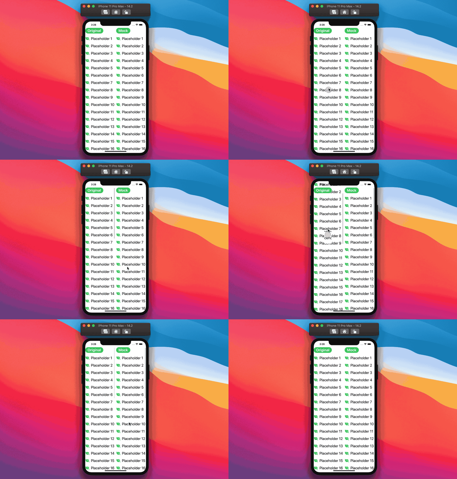
In the video, the content size was put to
ExtraSmallto make the view fit nicely on the screen.
The complete project can be found here.
Conclusions
The duck test says, "If it looks like a duck, swims like a duck, and quacks like a duck, then it probably is a duck.":
while we don't have access to SwiftUI's source code, our test shows that our LazyVStackMock, which is just a one-column LazyVGrid in disguise, perfectly matches LazyVStack in all scenarios.
We cannot guarantee that this is the case, but I still find it super interesting that SwiftUI's lazy stacks are just a specific implementation of their grid counterparts.
A framework goal is to empower adopters to build great things with as little friction as possible:
the SwiftUI team could have told us to create a lazy grid with one flexible GridItem every time we need a one column/row layout. Instead, having these lazy stacks backed-in makes it easier (and faster!) to create such common designs, all without requiring to know how grids work or even about their existence.
What about lists?
If, from the preamble, you've been wondering about Lists: yes! You'd be completely right: this component sounds a lot like the SwiftUI's version of UIKit's table view.
List also shares the same path with UITableView:
UITableViewwas introduced in iPhone OS 2.0 (in 2008), whileUICollectionViewwas introduced in iOS 6.0 (six years later).Listwas introduced along SwiftUI in 2019, while lazy stacks/grids came a year later.
Does it mean that List is going to be deprecated as well? Well, we haven't seen the deprecation of UITableView yet, so it's hard to say when/if this will ever happen.
However, the answer is not for the time being:
while ScrollView + lazy stacks are much more flexible and customizable than Lists, Lists are the go-to place if we're after the iOS/system look. Along with various list styles, and other features such as tap highlight and swipe actions (all of which ScrollViews don't natively support yet, FB9142134).
Therefore SwiftUI's lazy views and ScrollView need to gain even more functionality and flexibility if we want this to happen. In the meanwhile, I can't wait to see what SwiftUI will bring us next!
 @zntfdr