Every SwiftUI Environment Value explained
SwiftUI's Environment is one of the most important pillars of Apple's declarative UI framework. There are many aspects of this infrastructure: in this article, let's review all environment values that SwiftUI offers.
Generic component values
controlSize(iOS, macOS)controlActiveState(macOS)isEnabledisFocusedredactionReasons
First we have a few generic values that are applicable to most views. Ideally, we observe them in our view styles, and act accordingly.
struct FSButtonStyle: ButtonStyle {
  @Environment(\.isFocused) private var isFocused: Bool
  @Environment(\.isEnabled) private var isEnabled: Bool
  @Environment(\.controlSize) private var controlSize: ControlSize

  func makeBody(configuration: Configuration) -> some View {
    configuration
      .label
      .scaleEffect(isFocused ? 1.2 : 1)
      .foregroundColor(isEnabled ? .accentColor : .gray)
      .padding(controlSize == .large ? 16 : 0)
  }
}
Check out How to create custom redacted effects for a dive into
redactionReasons.
Display values
calendardynamicTypeSizedisplayScalehorizontalSizeClass(iOS)layoutDirectionlocalepixelLengthtimeZoneverticalSizeClass(iOS)
The environment exposes important details of, well, the "view environment": such values give us a broader insight into where we're about to display our view, or how we're supposed to do so.
For example, we can use such values to make make our app layout adapt in different situations:
struct FSContentView: View {
  @Environment(\.horizontalSizeClass) private var horizontalSizeClass: UserInterfaceSizeClass?

  var body: some View {
    if horizontalSizeClass == .compact {
      TabNavigation()
    } else {
      SidebarNavigation()
    }
  }
}
struct FSContentView: View {
  @Environment(\.dynamicTypeSize) private var dynamicTypeSize: DynamicTypeSize

  var body: some View {
    if dynamicTypeSize.isAccessibilitySize {
      VStack {
        ...
      }
    } else {
      HStack {
        ...
      }
    }
  }
}
Most of these values can also be overridden by us. This is particularly useful when used with SwiftUI previews:
struct FSContentView_Previews: PreviewProvider {
  static var previews: some View {
    ForEach(DynamicTypeSize.allCases, id: \.self) { dynamicTypeSize in
      FSContentView()
        .environment(\.dynamicTypeSize, dynamicTypeSize)
        .previewDisplayName("\(dynamicTypeSize)")
    }
    .previewLayout(.sizeThatFits)
  }
}
View-specific values
The majority of environment values are meant to take effect on specific views. An example we're probably familiar with is view styles (Button styles, Label styles, TextField styles, etc.).
Here we will see interesting decisions/trade-offs that the SwiftUI team took in different situations.
The main three options the team had are:
- expose an environment value that can be both read and, optionally, written by third-party developers
- expose an associated view modifier and hide the environment value (e.g., all styles)
- expose both the environment value and the associated view modifier
List
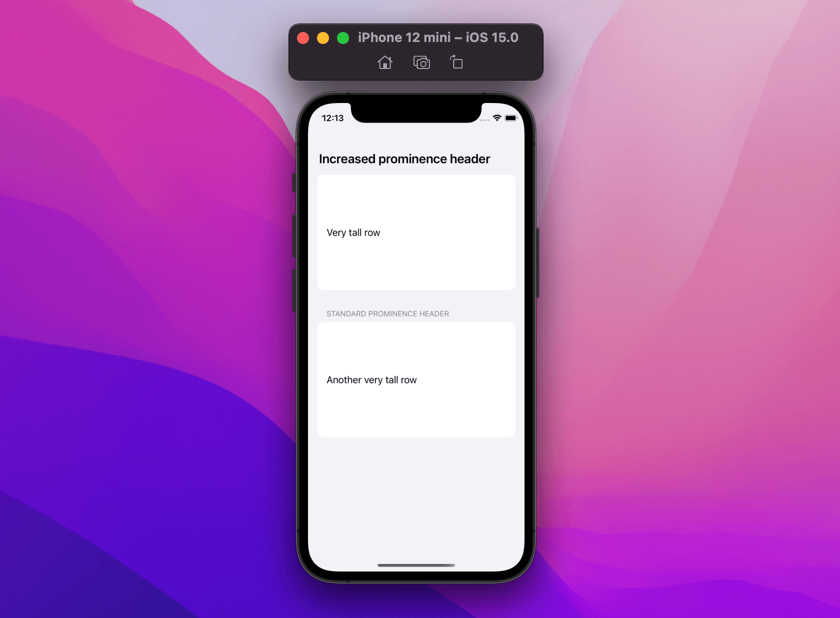
List {
  Section {
    Text("Very tall row")
  } header: {
    Text("Increased prominence header")
  }
  .headerProminence(.increased)

  Section {
    Text("Another very tall row")
  } header: {
    Text("Standard prominence header")
  }
}
// 👇🏻 sets the minimum row height to 200pt
.environment(\.defaultMinListRowHeight, 200)
Here we already see two of the three decisions above:
defaultMinListRowHeightanddefaultMinListHeaderHeightare exposed as environment values that can be both read and setheaderProminenceis also exposed as an environment value, but we can only set it via its associated.headerProminence(_:)modifier (attempting to setting it directly via.environment(\.headerProminence, .increased)won't have any effect, FB9543744)
Symbols
SF Symbols have received wonderful updates this year thanks to their new variants and modes, these parameters are also available for our views to observe:
struct FSView: View {
  @Environment(\.symbolVariants) private var symbolVariant: SymbolVariants
  @Environment(\.symbolRenderingMode) private var symbolRenderingMode: SymbolRenderingMode?

  var body: some View {
    ...
  }
}
However, most likely, we will use them to apply such options on Label or other places where we use SF Symbols:
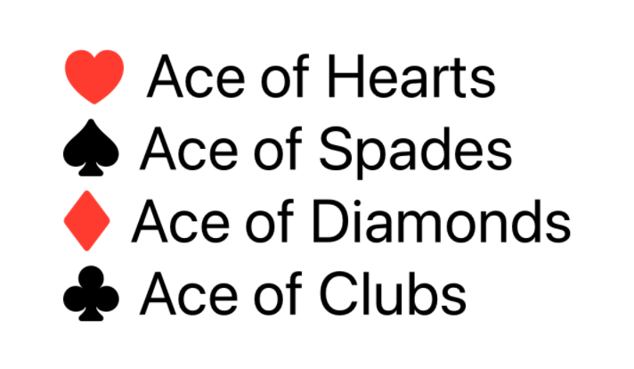
VStack(alignment: .leading) {
  Label("Ace of Hearts", systemImage: "suit.heart")
  Label("Ace of Spades", systemImage: "suit.spade")
  Label("Ace of Diamonds", systemImage: "suit.diamond")
  Label("Ace of Clubs", systemImage: "suit.club")
}
.symbolRenderingMode(.multicolor)
.symbolVariant(.fill)
Pickers
defaultWheelPickerItemHeight(WatchOS)
WatchOS only, this value lets us read and set the height of a wheel picker.
Picker("My Favorite Fruit", selection: $fruit) {
  ForEach(Fruit.allCases, id: \.self) {
    Text("\($0)" as String)
  }
}.environment(\.defaultWheelPickerItemHeight, 125)
Search
SwiftUI's new search functionality comes with a couple of environment values, which can be used, respectively, for:
- detecting when the user is doing a search
- provide an alternative way to dismiss/stop the current search
struct StarredReposList: View {
  @StateObject var viewModel = SearchViewModel()
  @Environment(\.dismissSearch) var dismissSearch
  @Environment(\.isSearching) var isSearching

  let query: String

  var body: some View {
    List(viewModel.repos) { repo in
      RepoView(repo: repo)
    }
    .overlay {
      if isSearching && !query.isEmpty {
        VStack {
          Button("Dismiss search") {
            dismissSearch()
          }
          SearchResultView(query: query)
            .environmentObject(viewModel)
        }
      }
    }
  }
}
Example from Mastering search in SwiftUI by Majid Jabrayilov.
Keyboard shortcuts
keyboardShortcut(iOS, macOS)
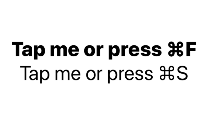
struct ContentView: View {
  var body: some View {
    VStack {
      Button("Tap me or press ⌘F") {
        print("tapped or pressed")
      }
      .keyboardShortcut("F", modifiers: [.command])

      Button("Tap me or press ⌘S") {
        print("tapped or pressed")
      }
      .keyboardShortcut("S", modifiers: [.command])
    }
    .buttonStyle(FiveStarsButtonStyle())
  }
}

private struct FiveStarsButtonStyle: ButtonStyle {
  @Environment(\.keyboardShortcut) private var shortcut: KeyboardShortcut? // 👈🏻

  func makeBody(configuration: Configuration) -> some View {
    configuration.label
      .font(.body.weight(shortcut == .init("F") ? .heavy : .regular))
  }
}
Example from What's new in Xcode 13 beta 3.
keyboardShortcut environment value lets us read the assigned keyboard shortcut to any view. We can use this value for example to customize the view appearance.
Text
fontlegibilityWeightmultilineTextAlignmenttruncationModelineSpacingallowsTighteninglineLimitminimumScaleFactortextCasedisableAutocorrection
Rendering and editing text is complicated. There are many parameters to consider at any given time. Apple platforms come with TextKit and Core Text for most advanced needs, which help us fine control various aspects such as text storage, layout management, and text geometry containment.
SwiftUI exposes none of that. However, text rendering/editing still manages to be SwiftUI's corner with the most number of dedicated view modifiers and environment values.
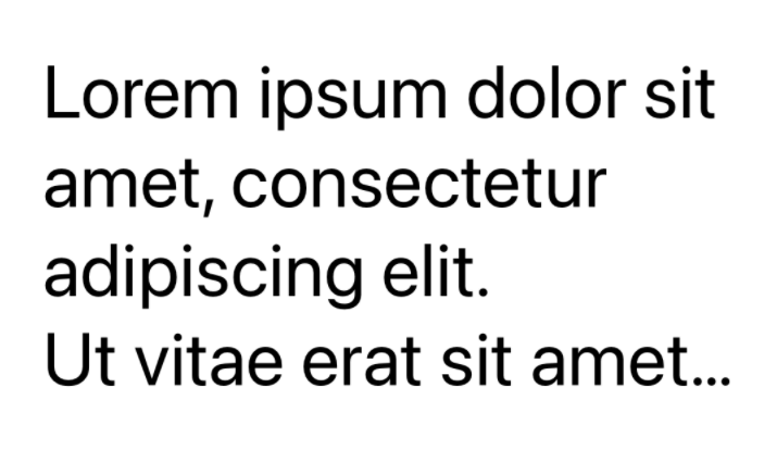
struct ContentView: View {
  var body: some View {
    Text(
      """
      Lorem ipsum dolor sit amet, consectetur adipiscing elit.
      Ut vitae erat sit amet risus hendrerit cursus.
      Aenean pulvinar ligula mauris, eu molestie magna sodales non.
      In malesuada mattis nibh, in gravida elit.
      """
    )
    .modifier(BenevolentLineLimit())
    .lineLimit(2)
  }
}

/// Doubles the `lineLimit` number.
struct BenevolentLineLimit: ViewModifier {
  @Environment(\.lineLimit) private var lineLimit: Int?

  func body(content: Content) -> some View {
    let newLineLimit: Int?

    if let lineLimit = lineLimit {
      newLineLimit = lineLimit * 2
    } else {
      newLineLimit = nil
    }
    return content.lineLimit(newLineLimit)
  }
}
This is just a sneak peek into text management on Apple platforms. See Cocoa Text Architecture Guide for much more.
Accessibility
accessibilityEnabledaccessibilityDifferentiateWithoutColoraccessibilityReduceTransparencyaccessibilityReduceMotionaccessibilityInvertColorsaccessibilityShowButtonShapesaccessibilityVoiceOverEnabledaccessibilitySwitchControlEnabled
struct ContentView: View {
  @Environment(\.accessibilityReduceTransparency) var reduceTransparency

  var body: some View {
    VStack {
      ...
    }
    .background(Color.red.opacity(reduceTransparency ? 1 : 0.5))
  }
}
Accessibility has always been a main focus in SwiftUI: the number of view modifiers, environment values, documentation, etc., really shows that.
Unlike most other values, accessibility environment values are (nearly) all read-only.
Presentation
The environment also gives us important values regarding the current presentation state, and even let us take control of the view presentation itself:
struct FSSheet: View {
  @Environment(\.dismiss) var dismiss

  var body: some View {
    Button("Dismiss Me") {
      dismiss()
    }
  }
}
Actions
openURLrefreshresetFocus(macOS, tvOS, watchOS)
This year we've seen new actions as environment values, which let us both grab and set closures that are then invoked by other views down the hierarchy:
struct FSView {
  @Environment(\.openURL) var openURL

  var body {
    ...
  }

  func onOpenURLTap(_ url: URL, completion: @escaping (_ accepted: Bool) -> Void) {
    openURL(url, completion: completion)
  }
}
Example from Handling links with SwiftUI's openURL.
Colors/Themes
The environment makes it easy to propagate preferences such as colors and themes. SwiftUI comes with a few values of its own:
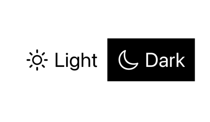
struct FSView: View {
  @Environment(\.colorScheme) var scheme

  var body: some View {
    Label(title, systemImage: systemImage)
  }

  var title: LocalizedStringKey {
    switch scheme {
      case .dark: return "Dark"
      case .light: fallthrough
      @unknown default: return "Light"
    }
  }

  var systemImage: String {
    switch scheme {
      case .dark: return "moon"
      case .light: fallthrough
      @unknown default: return "sun.max"
    }
  }
}
One-off
Lastly, we have a couple of environment values that are not strictly associated with any view, but still need to be propagated into and managed within the environment.
struct AddItemView: View {
  @Environment(\.managedObjectContext) var managedObjectContext
  @State var itemTitle: String = ""

  var body: some View {
    ...
  }

  var addButton: some View {
    Button("Add item") {
      let item = FSItem(context: managedObjectContext)
      item.title = itemTitle
      try? selfmanagedObjectContext.save()
      // to do: navigate back and handle errors
    }
  }
}
For a great introduction on
UndoManager, check out Handling Undo & Redo in SwiftUI by Matthaus Woolard.
Conclusions
SwiftUI exposes over 50 environment values (without considering deprecated ones). I'd argue that the SwiftUI team has been conservative on what to make public:
more values could be exposed as read-only, foregroundColor and tintColor immediately come to mind (FB8161189, FB9552347).
Do you use or define environment values in your apps? Let me know via email or Twitter!
 @zntfdr