Displaying text in SwiftUI
 @zntfdr
In Composing SwiftUI views we've covered an example on how to start building a design system, and how it's very beneficial to have one as early as possible in any project.
In this article, let's continue building our design system with a new component, a button:

The start
In this case we're lucky, as our app only has one design. We don't even need to create a new ButtonStyle! Just in case, we build one anyway:
struct FSButton: View {
  let titleKey: LocalizedStringKey
  let action: () -> Void

  init(_ titleKey: LocalizedStringKey, action: @escaping () -> Void) {
    self.titleKey = titleKey
    self.action = action
  }

  var body: some View {
    Button(action: action, label: { Text(titleKey).bold() })
      .buttonStyle(FSButtonStyle())
  }
}

private struct FSButtonStyle: ButtonStyle {
  func makeBody(configuration: Configuration) -> some View {
    HStack {
      Spacer()
      configuration.label
        .foregroundColor(.white)
      Spacer()
    }
    .padding()
    .background(
      RoundedRectangle(cornerRadius: 8, style: .continuous).fill(Color.green)
    )
    .opacity(configuration.isPressed ? 0.5 : 1)
  }
}
Which we can use as follows:
FSButton("Button title") {
  // button tap action
}

Great! We’re happy with FSButton: we add a couple of previews and move to the next design system component.
One week later
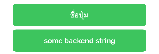
One week pass by and we're told by management that some of the buttons text will be provided by our backend instead of being handled by the app.
In order to use our current API, we would need to explicitly convert the backend string into a LocalizedStringKey:
var backendString: String

...

FSButton(LocalizedStringKey(backendString), action: buttonDidTap)
However this is "not ideal" in many levels:
- we're misusing
LocalizedStringKey - we're triggering a runtime lookup for a string that we already know won't be in our
Localizable.stringtable - it's just...not ideal
A nicer way to handle this would be to use the init<S: StringProtocol>(_ content: S) Text initializer, of which purpose is to display strings as they are, without trying to localize them first.
We need a way to accommodate both this new initializer and also our previous one. A solution is to have FSButton replace its titleKey LocalizedStringKey property with a title Text:
struct FSButton: View {
  let title: Text
  let action: () -> Void

  init(titleKey: LocalizedStringKey, action: @escaping () -> Void) {
    self.title = Text(titleKey)
    self.action = action
  }

  init<S: StringProtocol>(_ content: S, action: @escaping () -> Void) {
    self.title = Text(content)
    self.action = action
  }

  var body: some View {
    Button(action: action, label: { title.bold() })
      .buttonStyle(FSButtonStyle())
  }
}
With this update FSButton initializers will create on the fly the Text instance with the proper initializer:
FSButton(titleKey: "my_localized_title", action: { ... })

var backendString: String = ...
FSButton(backendString, action: { ... })
You now know how to write "Button title" in Thai!
One more week later
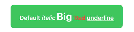
The marketing team has heard about the button's text backend-driven approach, and now they want us to make it possible for them to also drive designs such as this one:

This is not possible with our two initializers. However, Text is one of most flexible and dynamic SwiftUI views, it has a whole suite of ad-hoc modifiers that return other Text views, and it's even possible to add Text views to other Text views, with the outcome still being another Text:
let text: Text =
  Text("Default ") +
  Text("italic ").italic() +
  Text("Big ").font(.title) +
  Text("Red ").foregroundColor(.red) +
  Text("underline").underline()
Therefore, in order to support this new request, all we need to do from FSButton's point of view is to expose a new initializer that accepts a Text:
extension FSButton {
  init(_ title: Text, action: @escaping () -> Void) {
    self.title = title
    self.action = action
  }
}
Which makes it possible to create views such as:
Note that, thanks to this last initializer, we can completely override the default style of our button Text, with different font, weight, text color etc. which opens to a variety of new button styles for free.
...where does it end?
So far we've managed to keep our button content a Text view, however there might be a day in the future where that changes:
at that point we will probably need to extend our view to accept a view builder instead, which we've already covered here.
In conclusion, where should we start and what should we expose is really up to us, for example:
- if we're building a library/design system and we want to force whoever adopts it to use our style, we're probably ok by exposing just the two
LocalizedStringKeyandStringProtocolinitializers - if we want to offer more flexibility, we can let developers pass a
Textinstance, which opens a whole world of customization, while still requiring the main content to be aText - lastly, if we really want to open to infinite possibilities, we can expose an initializer that accepts a view builder, at which point the customization limits are our imagination's
The final project can be found here.
Conclusions
Building SwiftUI components displaying text can be trickier than expected, however most use cases can be covered with little work on our side.
The same approach and thought process we've see here has been applied in many SwiftUI views definitions as well, where different views will expose different initializers.
If you're looking for inspiration, here are some SwiftUI views that use this approach:Button, ColorPicker, CommandMenu, DatePicker, DisclosureGroup, Label, Link, Menu, NavigationLink, Picker, ProgressView, SecureField, Stepper, TextField, Toggle, WindowGroup.
..and even a few modifiers such as navigationTitle and help.
Do you use this approach when building SwiftUI views? Have you used/seen any other patterns? Please let me know!
Thank you for reading and stay tuned for more articles!